Layouts
Well-designed layouts don’t just make websites visually appealing, they make them usable. With good structure, users can navigate easily and search engines can understand your content. Each layout technique we’ll cover serves a specific purpose and, no technique is designed to be used in isolation.
WebbsAI uses four main layout techniques:
- Block
- Inline Block
- Grid
- Flex
Elements have default display values that depend on the type of element. More often, they have one of the two most common display values: Block and Inline Block.
Block
A block-level element always takes up the full width of its parent container, irrespective of the value set. When added to a page, it starts on a new line, taking up the entire line. As you adjust the width of your parent element, the block-level element responds by changing with it.
If an element isn’t a block by default, you can change it’s display value to be a Block. This property is always applied to the element itself.
Common block-level elements are <div>, <p>, <article>, <footer>, etc.
How to set Block in WebbsAI
Observe what happens when you drag a container onto your page, select the heading option, and position it inside the container.
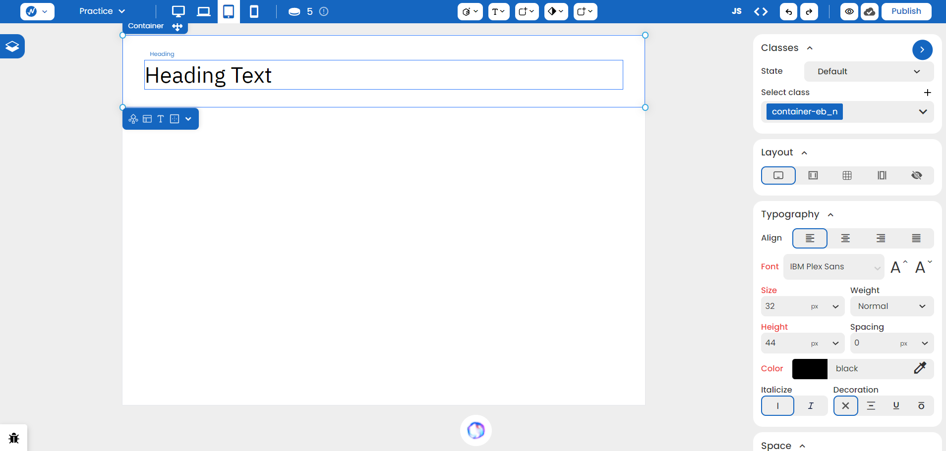
Although the content does not take up the full line, the element itself occupies the complete width.
If you select a text element and try placing it inside the container, it creates new lines in the structure.
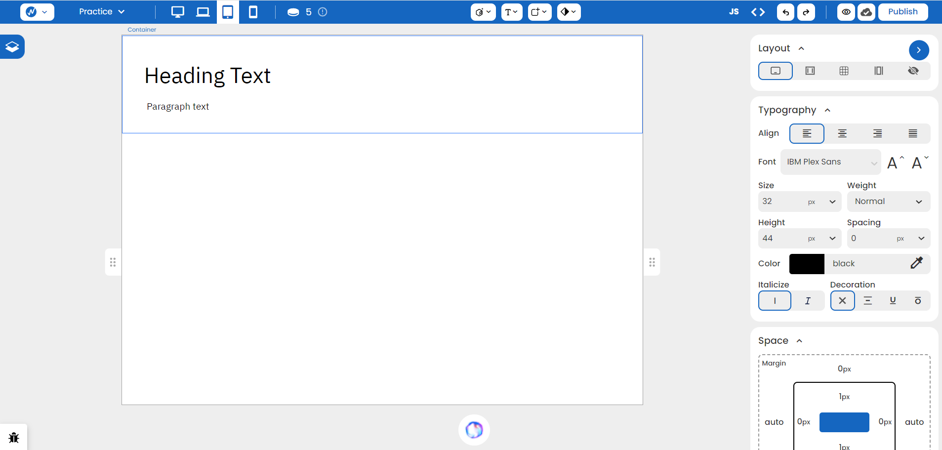
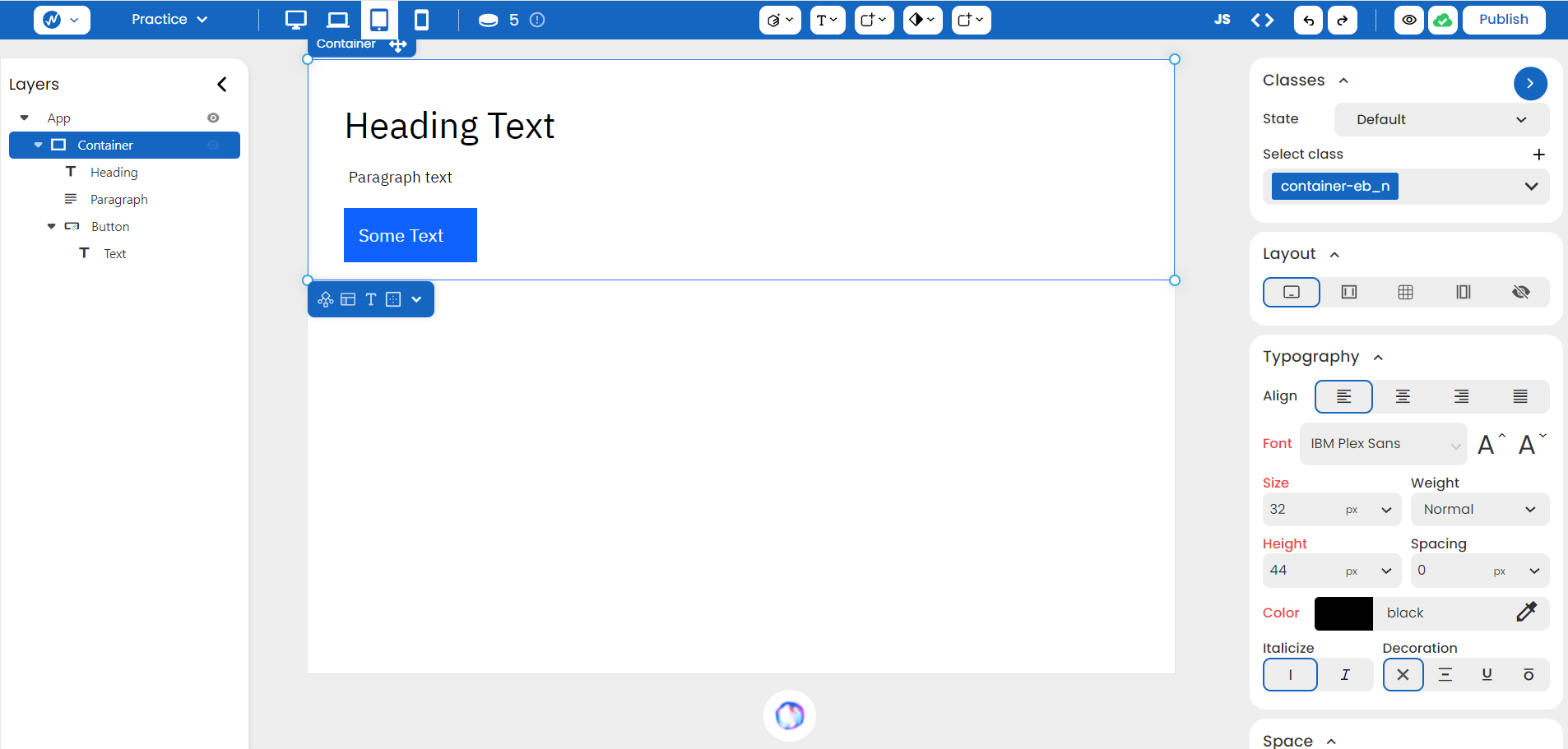
In this way, you can add buttons, lists, or any elements of your choice; the container grows a new line with each addition.
CSS Syntax
Syntax:
display: block;Example:
selector {
	display: block;
}
Inline Block
These elements only occupy the width equal to the size of the content inside. This allows different Inline Block elements to sit side-by-side on the webpage. Inline Block elements can have their width and height set, so they allow for precise control over the size and spacing of the element.
How to set Inline Block in WebbsAI
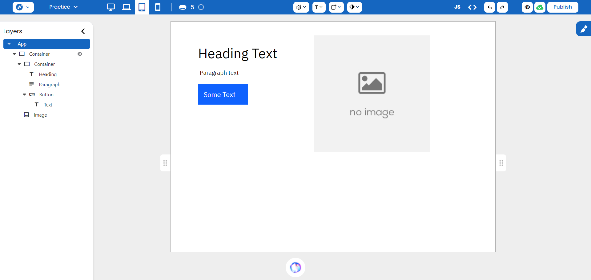
An element can have an Inline Block layout at Styles > Layouts > Inline Block. Quoting the Block example, we can modify the earlier structure by adding an image to the right. For structural clarity, we encase our pre-made structure in another container. This allows positioning the first container (holding your existing content) to the left and the image to the right, both contained within the larger outer container.
Here’s how to achieve this:
- Drag a container onto the page.
- Open the “Layers” panel on the left.
- Drag your existing pre-made structure into the newly added container.
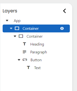
Remember, Inline Block applies to the element being positioned itself, not its enclosing container. This means both the image and the container holding your other elements must have their layout set to ‘Inline Block’.
CSS Syntax
Syntax:
display: inline-block;Example:
selector {
	display: inline-block;
}
Grid
This display style allows for two-dimensional layouts to be created on your website. With a Grid, the section on your page is divided into rows and columns, providing an organized structure and arrangement for your content.
How to set Grid in WebbsAI
You can segment a structure into a grid by selecting Styles > Layout > Grid on your container element. To optimize your layout, consider dividing it into two columns, as shown in the image.
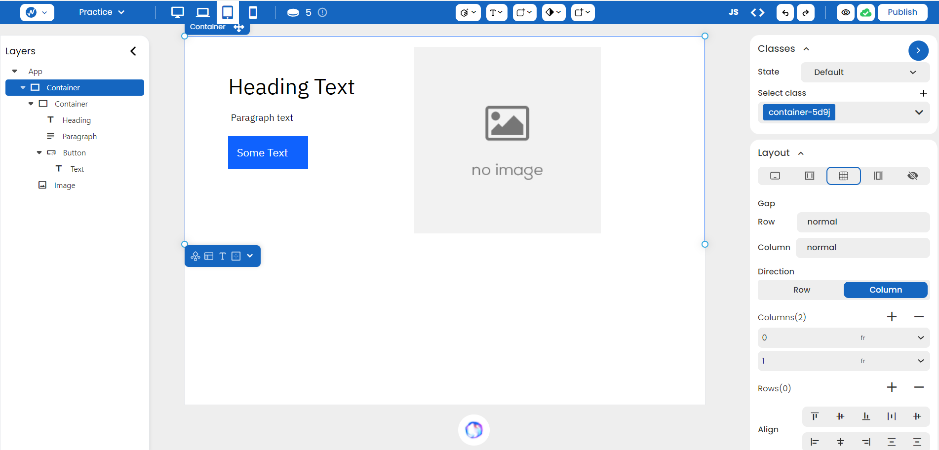
Grid layout goes beyond mere gridlines. It offers powerful options for positioning your content within the defined rows and columns. You can:
- Center elements within their cells.
- Align them left, or right, or justify them evenly across the grid.
- Distribute them within the available space.
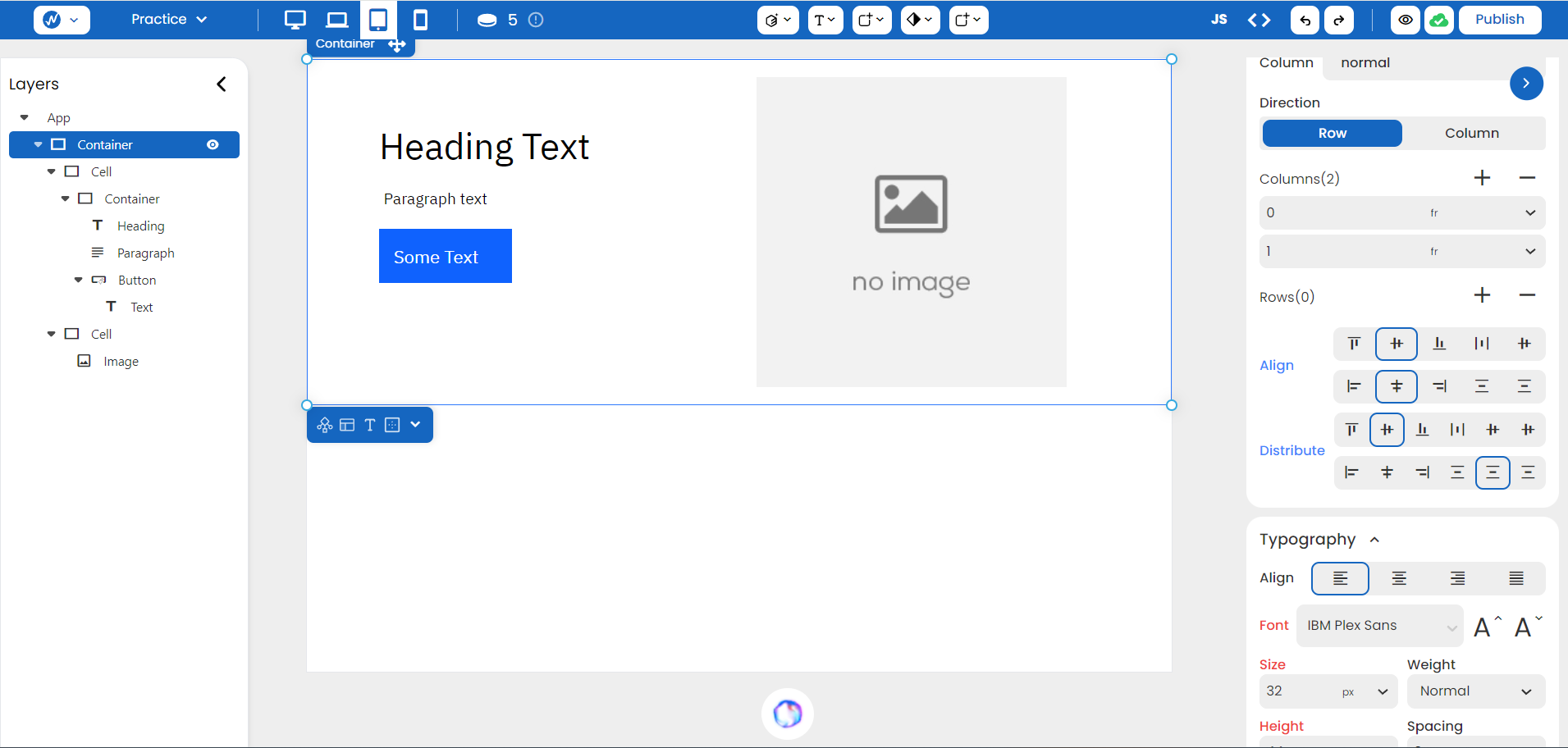
NOTE: You can see a new unit listed beside the Rows and Columns features as ‘fr’. It is a flexible unit that represents a fraction of the available space in the grid container. For example, if you set a column to be “1fr” and another column to be “2fr,” the second column would take up twice as much space as the first.
CSS Syntax:
Syntax:
parent-element {
	display: grid;
}
You can then specify how you want your rows and columns to be structured using:
-
grid-template-rows: <size of row 1> <size of row 2> …; -
grid-template-columns: <size of col 1> <size of col 2> …;
parent-element {
	display: grid;
	grid-template-rows: 100 px 200 px;
	grid-template-columns: 300 px 300 px;
}
Flex
Flex is useful for building one-dimensional layouts so there’s a more efficient and predictable way to align items within a container-either as a row or as a column. This is when the size of the items is unknown or dynamic.
A flex works with two axes: one main axis and a perpendicular cross axis. Your items are always placed in the main axis direction when you set the display property of a container to flex. The direction of this main axis can be changed as well using:
- row: The main axis is horizontal (left to right).
- column: The main axis is vertical (top to bottom).
Another key flex feature is aligning and justifying items on the main and cross axes, and distributing space between flex items. These properties are to be set on the flex container, not the items themselves. You can do this using two main properties:
- Align the items on the cross axis- left, center, right, stretch, and baseline
- Justify content on the main axis - left, center, right, space-between, and space-around.
How to set Flex in WebbsAI
You can set a container and its elements as a flex structure by setting ‘Flex’ in Styles > Layout. To achieve a layout similar to the previous examples, simply set the “Direction” property to “Row”.
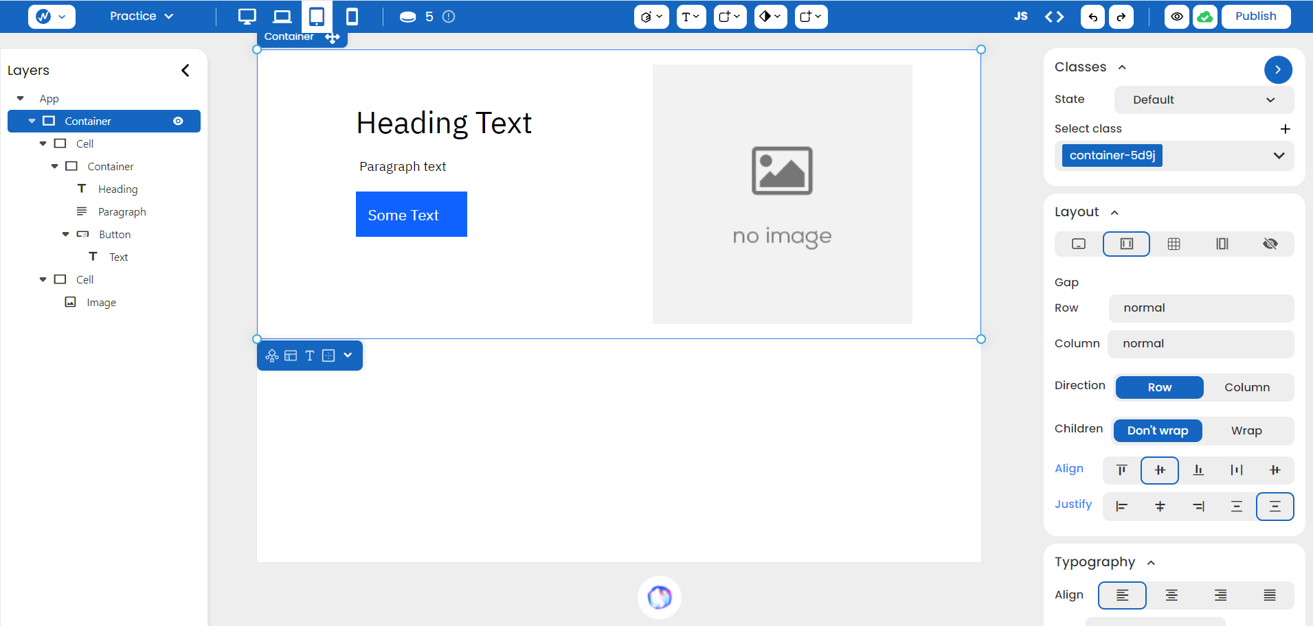
Just like the grid, you can choose to align the items in your flex a certain way and even control how items wrap around to a new line for optimal responsiveness
CSS Syntax:
Syntax:
parent-element {
	display: flex;
}
You then define the main axis’s direction, along which the flex items are placed in the flex container. It can be set to ‘row’, ‘row-reverse’, ’column’ or ‘column-reverse’. To control whether the flex items should be forced into a single line or have the ability to wrap onto multiple lines, you can use the ‘flex-wrap’ property.
parent-element {
	display: flex;
	flex-direction: row;
	flex-wrap: wrap; /* items will wrap onto the next line when they exceed width */
}
Lastly, you can add ‘justify-content’ and ‘align-items’ to determine how the items are distributed on your screen.
parent-element {
	display: flex;
	flex-direction: row;
	flex-wrap: wrap;
	justify-content: space-between;
	align-items: center;
}
Conclusion
By understanding the strengths and applications of various layout techniques like Block, Inline Block, Grid, and Flex, you can create flexible and structured designs that adapt seamlessly to different screen sizes and user interactions.