Units
Now that you are more familiar with how a lot of properties work in styling a website, it is important to know what values should be used to adjust and set the appropriate size in such a way that your website is responsive. For this, the concept of units holds immense importance.
In both CSS and WebbsAI, units help determine the length and measurement of something whether it is text, margins, padding, or any shape being manipulated. Mainly, units are categorized into two broad groups: Absolute Units and Relative Units.
Absolute Units
They are measurement units that are fixed and provide a constant size irrespective of the properties of the parent or any surrounding elements. You can resize your screen but their length won’t change.
While there are many different types of units used in CSS, the most important one (also the only absolute unit used by WebbsAI) is a pixel. As you’ve seen used commonly in examples before, a pixel defines the smallest unit of measurement in digital systems. You can think of it as a dot on the screen.
How to set pixels in WebbsAI:
Suppose we have the following content displayed on our canvas:
Good morning!
The weather is so pleasant today.
Let’s go for a walk!
Here, each line is in its own tag and all three are encased in a container.
To illustrate, we start by setting the size of the heading to 50 pixels from Styles > Typography > Size:
![]()
Since a pixel is an absolute unit, it doesn’t matter if we resize our container or resize the whole screen; the heading size will remain the same.
![]()
Through pixels, you can set margins, paddings, width, height, and any property that requires length or size.
CSS Syntax:
Syntax:
[property]: [value]px;Example:
selector {
	font-size: 24px;
}
Relative Units
Measurements that are defined in relation to some other aspect of the document, mainly referring to the size or any other characteristic of the parent or root element. These units are more flexible because they can be resized along with the screen.
A very simple example to demonstrate the difference between the two can be using two cups of flour for a batch of cookies. Because the unit ‘cups’ doesn’t change with respect to anything, it can be called an absolute measurement. However, if you decide to adjust the recipe to make a larger batch of cookies, you’ll use something like a ratio, which helps scale your recipe. This alternate scenario can be said to make use of relative measurements.
There are many different units used for relative adjustment:
Percentage (%)
Percentage values are relative to the size of their parent element. For example, setting the width of a paragraph tag (a child element) inside a div tag (a parent element) to 50% means the paragraph takes up half the width of the div’s width.
How to set percentages in WebbsAI:
With recall that a child element’s size scales respectively to the parent element’s size, we go to Styles > Typography > Size of our heading element and change the 50px to 50%.
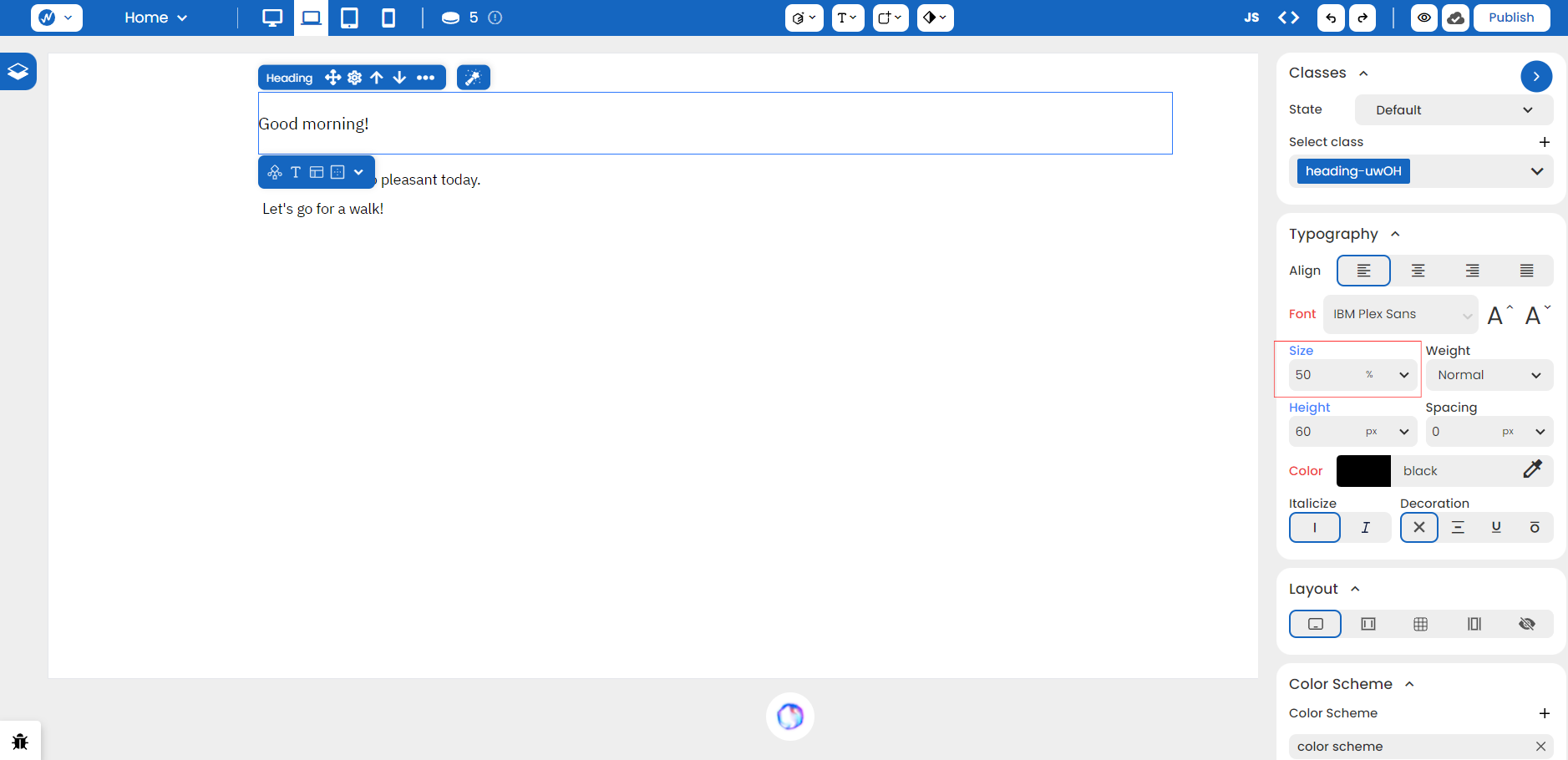
Right off the bat, notice that the font-size decreases. This is because the heading’s font-size is now 50% of the font-size of the container.
NOTE: Since we are dealing with typography here, the size of the text refers to the font-size. Percentages are not only limited to the font-size but can be applied to all properties that are related to sizing.
If we increase the size of our container, the size of our heading increases with it. To show the difference, 32px is the original size of our container:
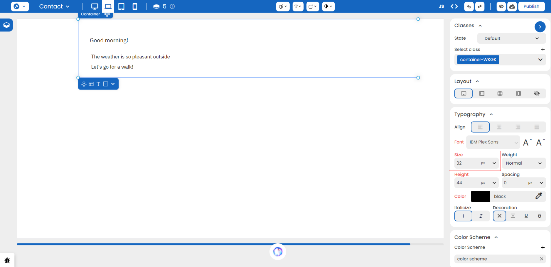
If we change the size of our parent element (the container) to 60px, notice how the heading element changes size automatically:
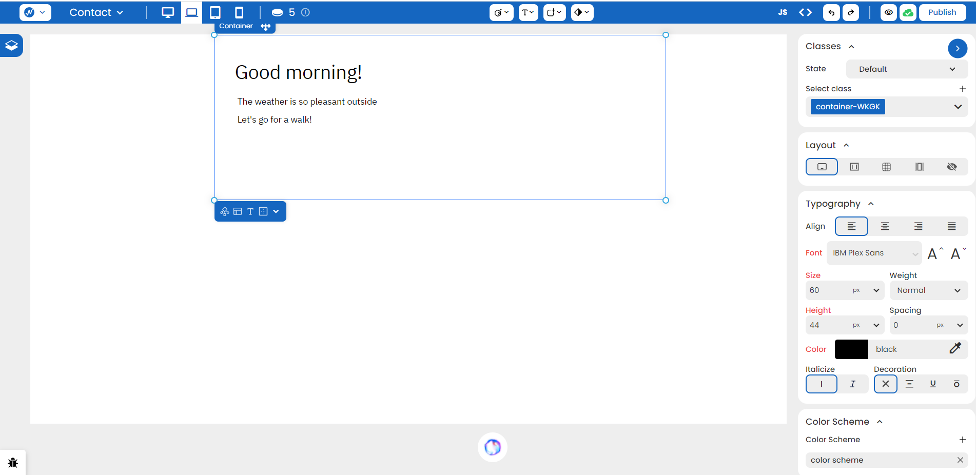
This is how relative units help in responsiveness for each screen size and better user experience on your website.
CSS Syntax:
Syntax:
[property]: [value]%;Example:
selector {
	width: 100%; /* element takes up the full size of its parent element */
}
Em (em)
These units are relative to the font-size of their closest parent element. When used within nested elements, the ‘em’ unit inherits its value from its direct parent.
For example, if there is a parent element defined with ‘font-size: 32px’ then for that parent and for its children, 1em = 32px. When the font-size for any one of the children is set to, let’s say 1.5em, the equivalent size in pixels for that child element becomes 1.5em * 32px = 48px.
In simpler words, you can calculate the em for any element using the formula:
(font-size for child element in em) * (current font-size of parent element in pixels) = (font-size for child element in pixels)
Note that em units on properties other than font-size will be relative to the font-size of the current element itself. It’s a little confusing, we know, but let’s test this out:
How to set ‘em’ in WebbsAI:
Because the previous example dealt with font-size, we will build on the same example for greater clarity. This time, we modify the paragraph tag of the second line of text.
Originally, we saw that our second line had a size of 14px.
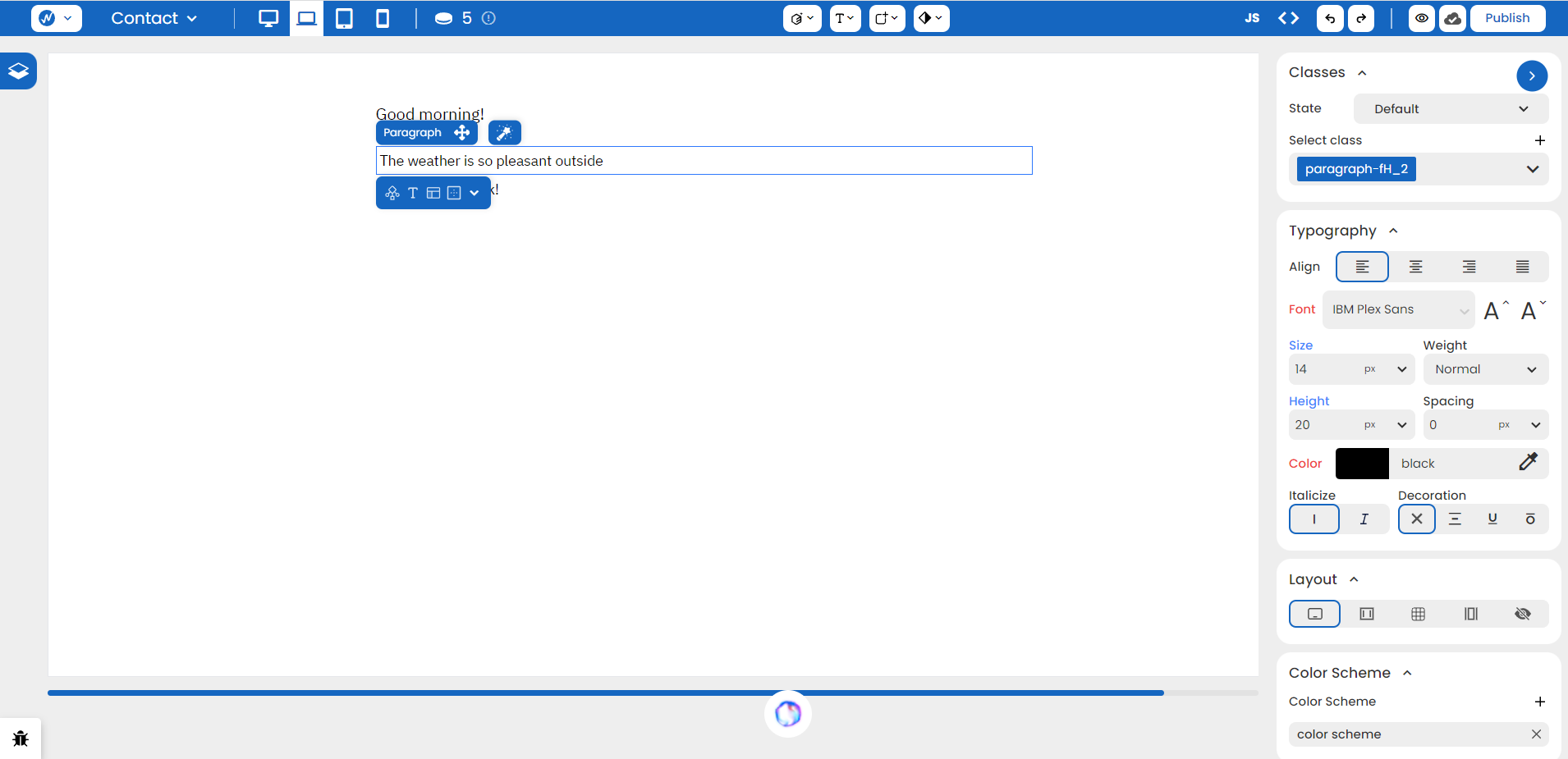
We change it to 0.5em:
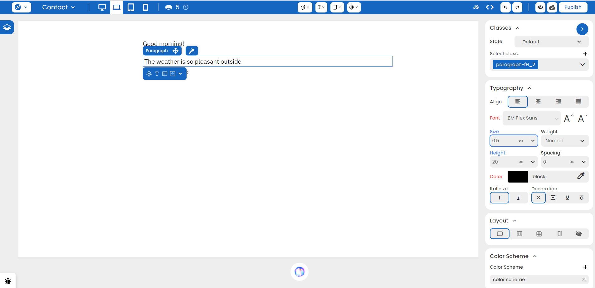
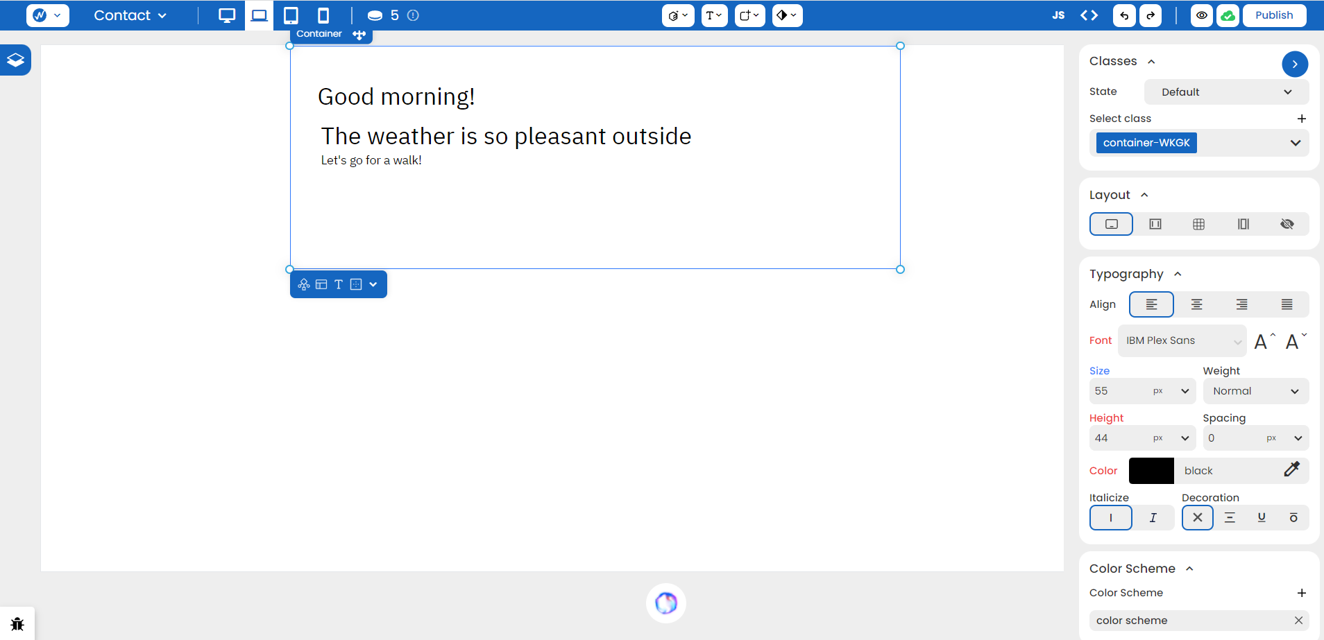
We can already see the difference in the element as it adjusts to this new unit type. Now, if we change the size of our container element, we’ll see that the paragraph tag will resize accordingly.
The next question is: What about properties other than the font-size? What if we want to change the line spacing? What if the height needs to be modified? Will all these properties also depend on the parent element’s font-size?
As explained earlier, it won’t work that way. All properties, besides the font-size, of a child element when set to ‘em’ will depend on the font-size property of the child element itself.
Let’s assume we are back at the original paragraph tag that has a 14px size. In the WebbsAI editor below the Size property, you can find a Spacing property. It is used to define the spacing between the letters of a content.
We modify the Spacing property to be 0.5em:

The content adjusts itself to the change.
To test what we claimed, we first change the Size property of the element itself.
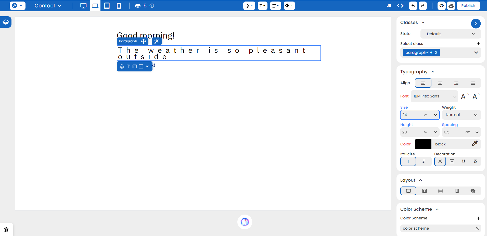
Notice how our Spacing increases as well.
To seal the deal, we go back to our container element and adjust its size.
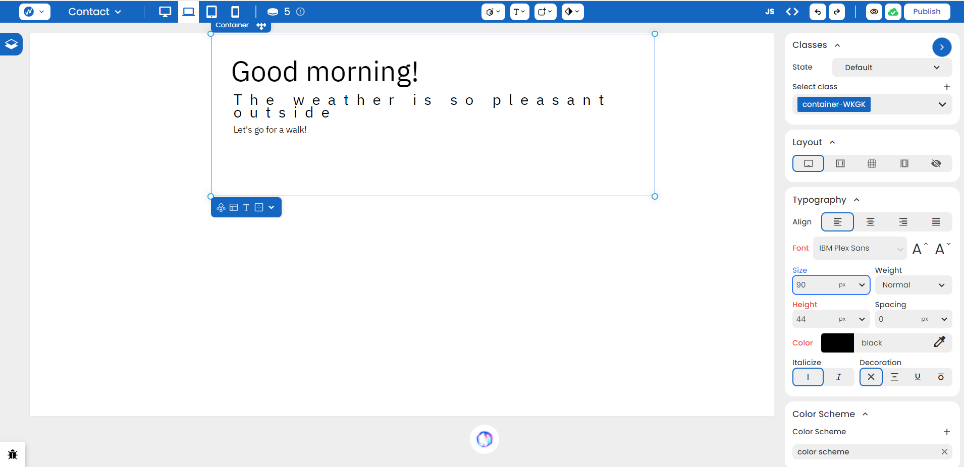
Only the heading tag changed (because the percentage value depended on the parent element size).
CSS Syntax:
Syntax:
[property]: [value]em;Example:
parent-selector {
	font-size: 24px;
}

child-selector {
	font-size: 0.5em;
}
Rem (rem)
The r in ‘rem’ stands for root. While similar to em, this value is relative to the font-size of the root element. Typically, the root element is the <html> element.
If the root element’s font size is 16 pixels, then 1rem is equal to 16 pixels.
The advantage of using rem is all elements using rem units will scale proportionally when the base font size of the root element is adjusted. In this way, there are no surprises or ripple effects due to changes in the parent element because everything only depends on the root.
CSS Syntax:
Syntax:
[property]: [value]em;Example:
.html {
	font-size: 16px;
}

selector {
	font-size: 2rem;
}
Character (ch)
This unit is relative to the width of the character ‘0’ in the element’s font. It’s super powerful, yet a little unpredictable due to the nature of different fonts.
In monospace fonts, where all characters are the same width, 1ch equals one character while in proportional fonts, any character could be wider or narrower than the ‘0’ character.
If you set an element’s width to 30ch, it will be around 30 times the width of the ‘0’ character in the current font. When you change the font size, the element’s width adjusts proportionally.
This unit type is mainly used in typography to make the text look more inviting and easier to read (something the other units don’t do as precisly). It is not intended to reference non-textual items or any form of graphics.
How to set ‘ch’ in WebbsAI:
To set the property of any text to have ‘ch’ unit, go to Styles > Typography > Size of that element and choose ‘ch’ from the dropdown. Specify a value that fits your content best.
CSS Syntax:
Syntax:
[property]: [value]ch;Example:
selector {
	font-size: 30ch;
}
Viewport’s width (vw) and Viewport’s height (vh)
A ‘vw’ is relative to the width of the viewport. 1 vw is equal to 1% of the viewport width whereas ‘vh’ is relative to the height of the viewport. 1 vh is equal to 1% of the viewport height.
NOTE: A viewport is the visible area of a web page on a user’s device. It can vary in size depending on the device and the browser settings.
If you set the width of an element to 30vw and its height as 50vw, and let’s assume that your visible web page area is 1500 pixels by 2000 pixels. This means your content will take up 30% width and 50% height of your total screen, making it out to be 450 pixels wide and 1000 pixels long in this particular scenario.
As your visible area increases and decreases depending on your device, so will your element.
How to set ‘vw’ and ‘vh’ in WebbsAI:
To set the property of any element to have ‘vw’ or ‘vh’ unit, look for the unit dropdowns alongside certain properties. By choosing either viewport width or viewport height from it, you can make your content look more dynamic.
CSS Syntax:
Syntax:
[property]: [value]vw;
[property]: [value]vh;Example:
selector {
	width: 50vw; /* Set the width to 50% of the viewport width */
	height: 75vh; /* Set the height to 75% of the viewport height */
}
Conclusion
In summary, choosing the right units is crucial for building websites that look good on all devices. Absolute units, like pixels (px), stay the same size no matter what. Relative units, such as percentages (%), ems (em), rem (rem), adjust based on the size of other things in the document. Understanding and using these units wisely will make your website not only look consistent but also work well on all sorts of screens.