Layouts and Elements
Just as small Lego blocks piece together to form one powerful structure, elements and layouts work together to make one incredible website. While you might be aware of how the tags work in HTML, it is time-consuming to create a number of pages out of them and the designing might take even longer.
WebbsAI makes the whole process a lot simpler and intuitive by giving you access to a range of drag-and-drop options so that all you need to do is bring the element onto the canvas, adjust its size, and fix it in place.
WebbsAI Editor Panel
After a draft for a website has been created, the user is directed to an editor panel that begins with a blank screen.

To access the predefined elements made available, simply click on the first option from the collection centered on the navigation bar.
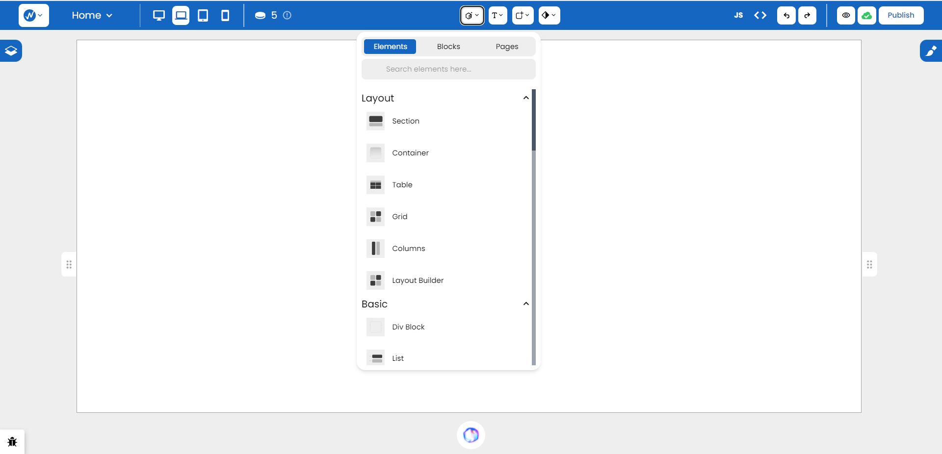
Layout
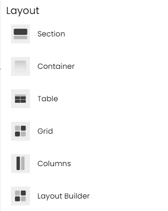
Section
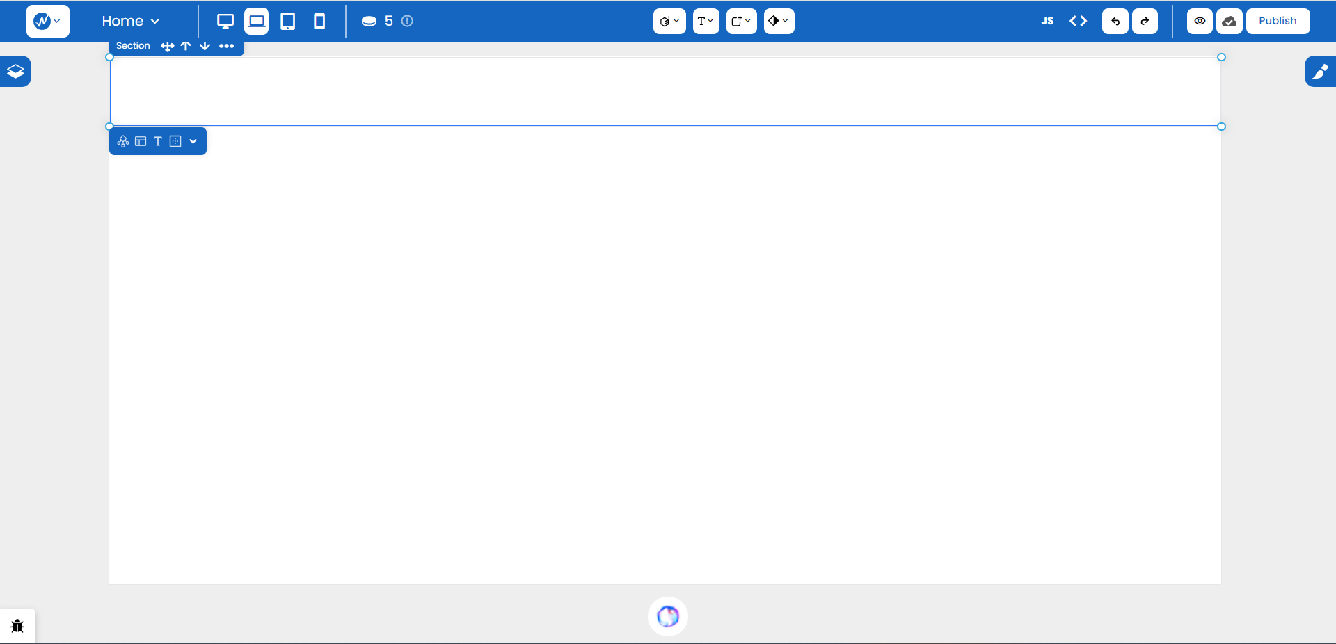
Right off the bat, you can see the section spans the full width of the screen. With recall, it is a semantic tag that is capable of holding a group of different elements together. If we add a heading and two paragraphs inside it, it grows to the collective height of all three.
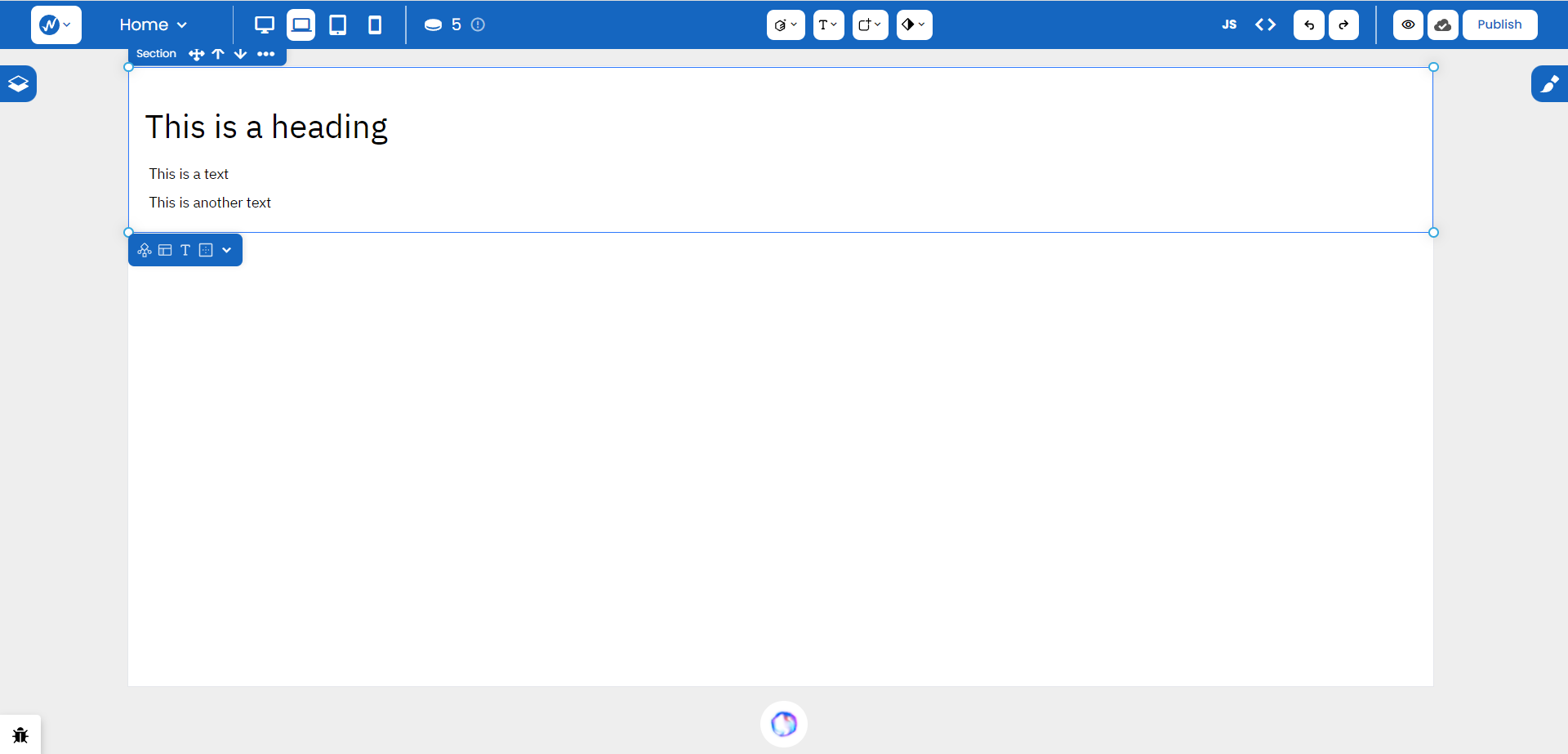
This helps make your content more semantically meaningful by creating organized divisions in several parts of your page.
Container
While the Container does not have any semantic meaning on its own, you can use it to group together and apply styles to sets of elements. It is simply a box for you to put your content in.

With a Container, you can adjust its size, alignment, and several other properties that provide a more personalized touch to your group.
Table
Through a series of rows and cells, the Table feature lets you organise your content in a more readable manner. The content can also include any details brought from your database. When you drop the feature onto the canvas, the editor provides the option to specify custom rows and columns which can also be adjusted later on.
Other layouts like Grid, Columns, and Layout Builder serve specific but integral roles but we’ll touch on them later on in the advanced topics of our lessons.
Basic
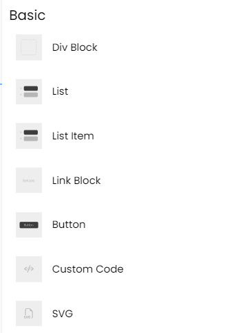
Div Block
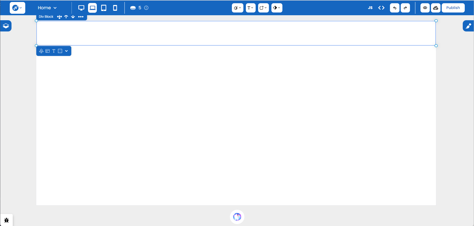
While Container was a more generic and broader term for an element that contains other elements, Div Block specifically refers to the <div> element in HTML. The difference is noticeable in the width each spans: Div Block takes up 100% of the screen’s width whereas the Container uses up only a fraction due to specific layout rules applied to it.
List and List Item
These two elements work in tandem to provide an element that hosts a list of items. When selecting the List feature, we are shown something like this:
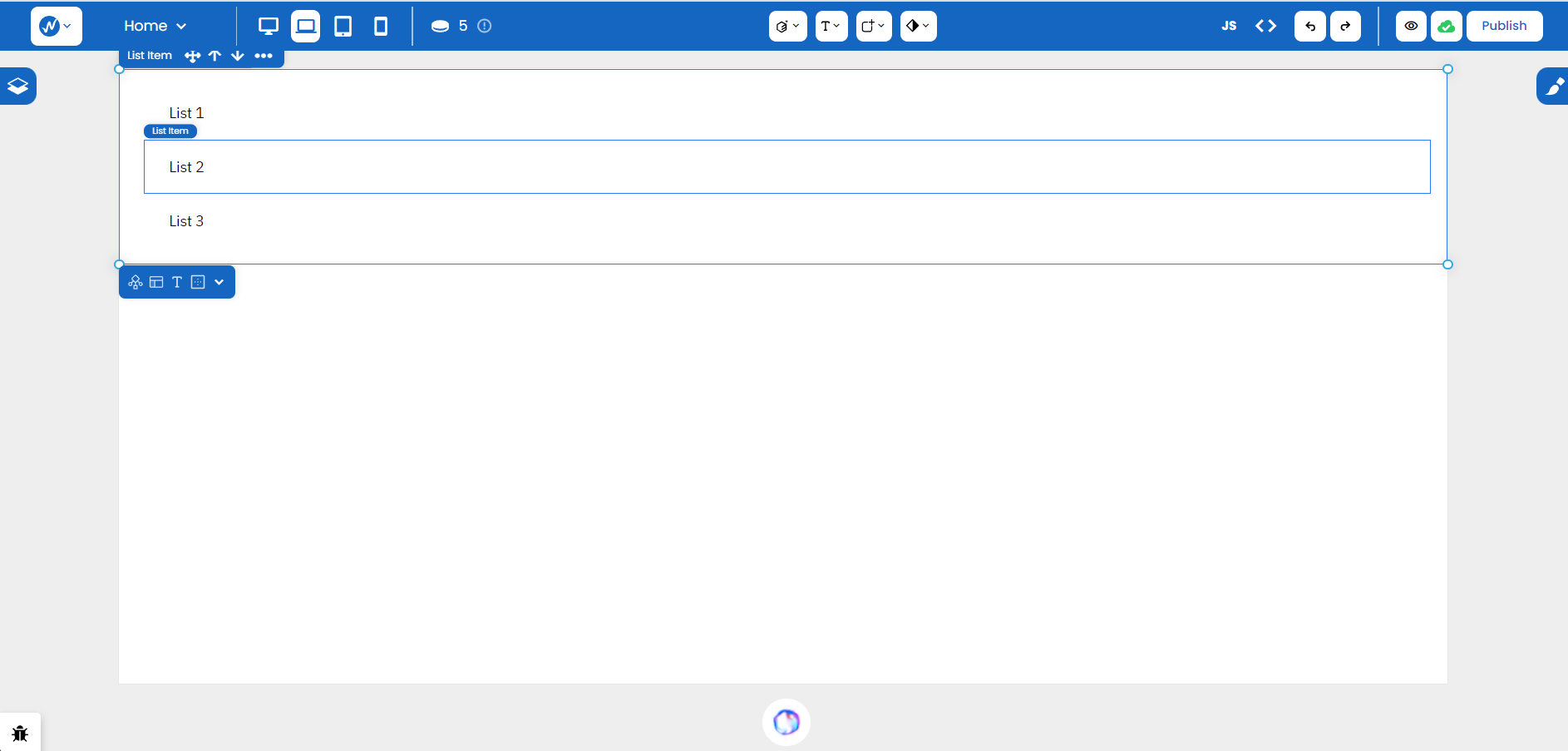
To add more items to List, simply place a List Item element one after the other inside the container.
Link Block
Much like how Div Blocks exist to group elements together, Link Block offers the same functionality - except the block itself is a link and any element you place inside it also acts as a link. With a destination URL specified, you can take the user to any page or site you’d like.
Button
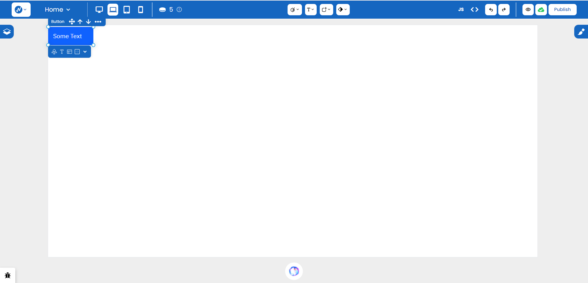
You can drag and place a button precisely where required on a canvas and use interactive features, like form submission, to trigger specific actions on your page.
SVG
Scalable Vector Graphics, or SVG, are like HTML for 2D graphics. They define different shapes and graphics so you can place them onto your screen without worrying about ‘pixelation’ upon resizing. They scale up and down according to the screen’s size so they are flexible in the creation of logos, icons, and illustrations.
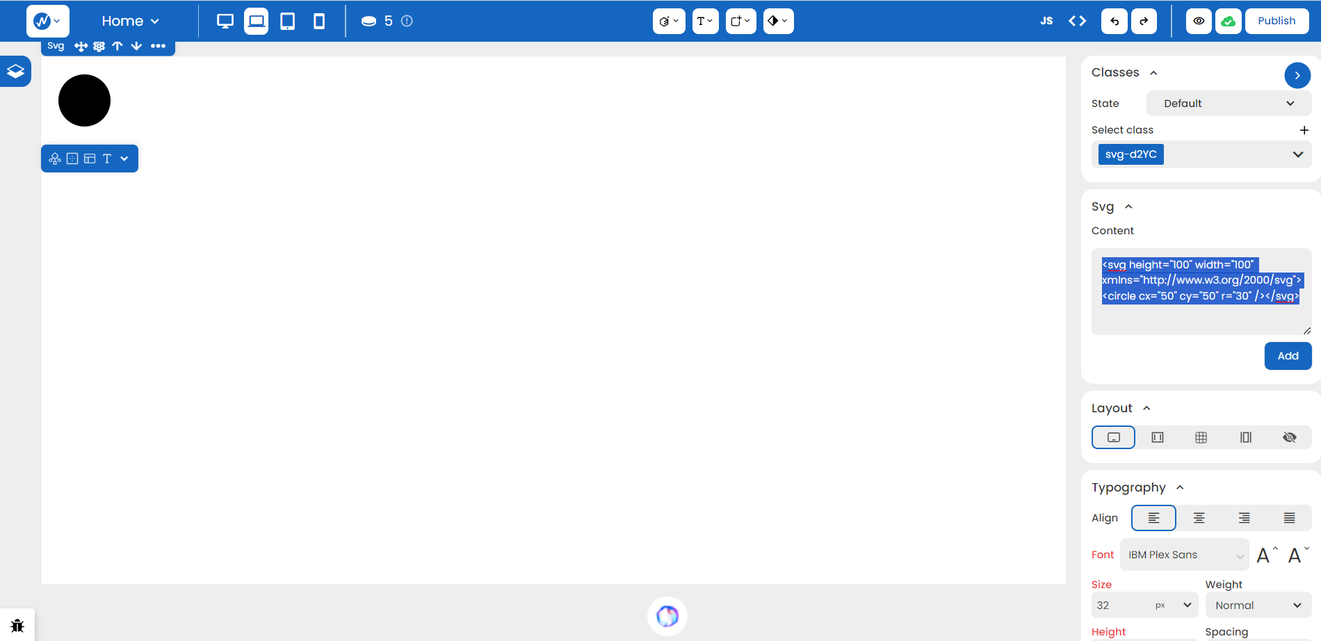
In Styles > SVG, you can adjust the shape of the graphics by modifying the content accordingly.
Typography
Heading, Paragraph, and Span
From creating well-structured and visually appealing headings to presenting textual content on your website either completely or to specific portions of text, you can use the options below for a well-organized and visually engaging arrangement.
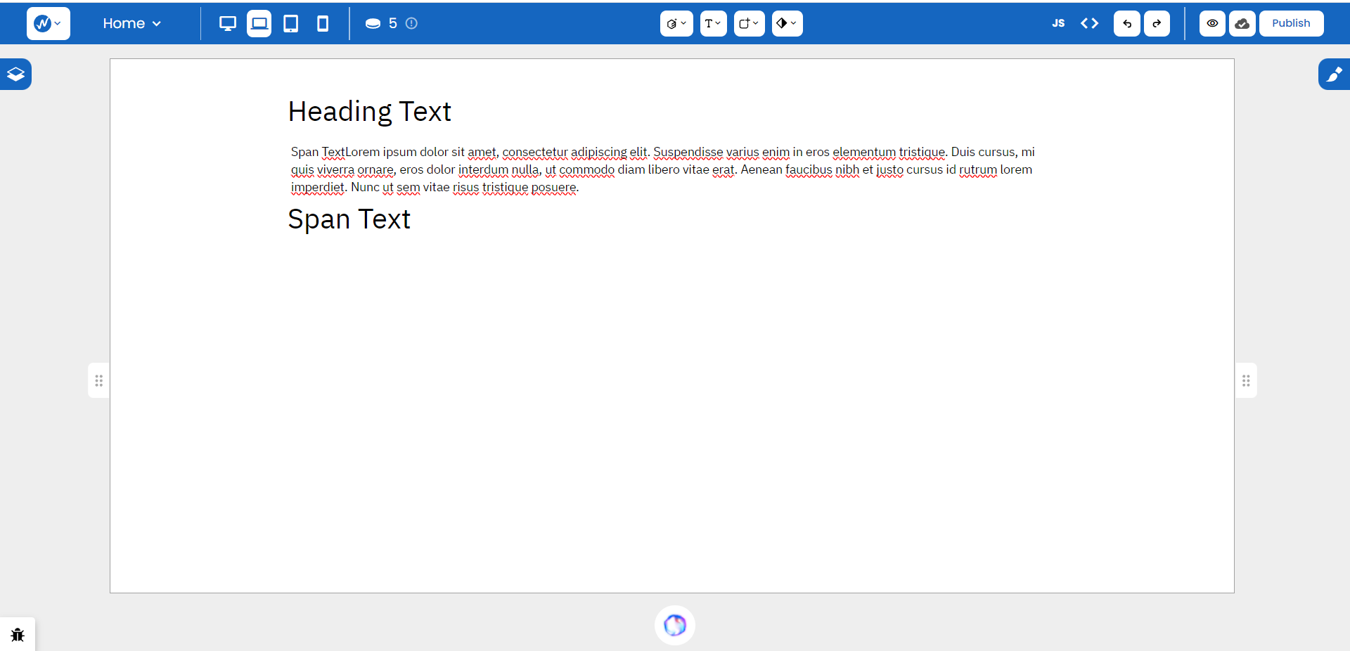
For quicker access, the second icon from the center panels in the navigation bar helps provide the same features:
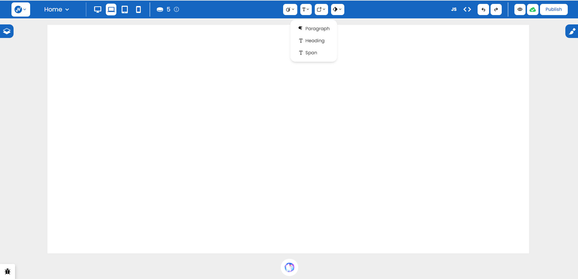
Text Link
The Text Link element allows you to create hyperlinks with ease. You can simply place it on the canvas, define the link’s destination URL, and add any additional text inside to act as the clickable link.
Text Block
The Text Block feature creates a versatile container for your text content. You can customize the size, font, color, and alignment of the text within the block which is why this element is perfect for displaying paragraphs or blocks of text with consistent styling.
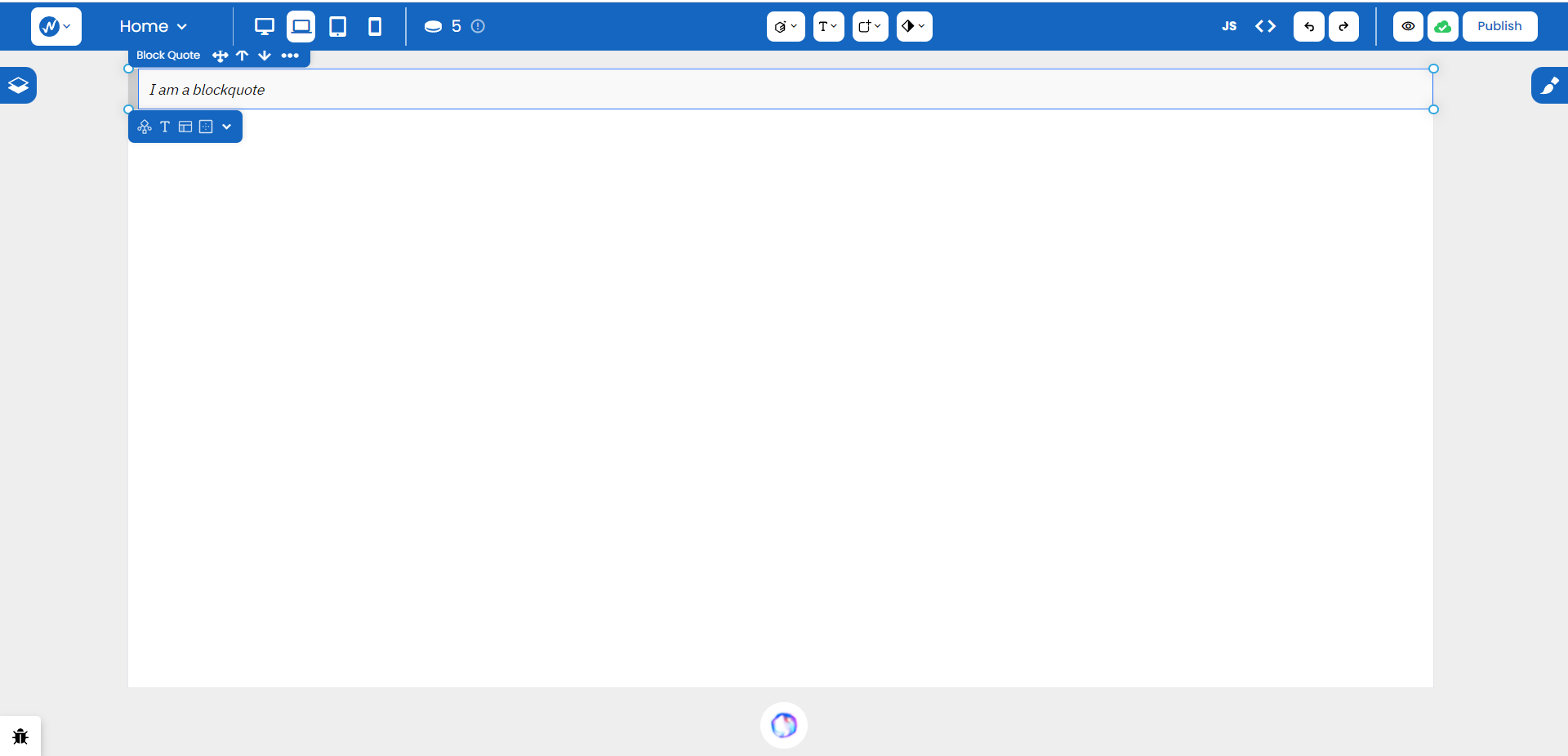
Block Quote
The Block Quote element is designed for showcasing quotations. It automatically applies a distinct styling to the quoted text, providing a visual cue to the reader. You can use this element to add emphasis and clarity when incorporating quotes into your content.
Rich Text
Rich Text is a powerful element that allows you to format text with a variety of styles.
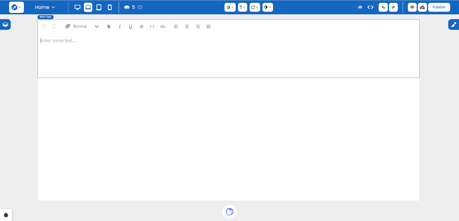
You can apply different fonts, sizes, colors, and formatting options, giving you the flexibility to create visually appealing and well-styled content.
Forms
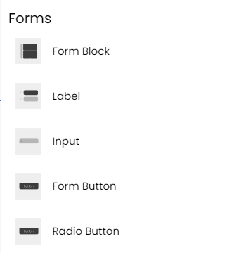
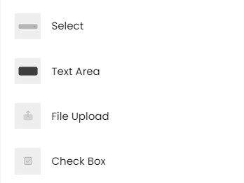
WebbsAI offers a range of form elements to streamline the creation of interactive forms. These include input fields, checkboxes, radio buttons, and more. You can easily drag and drop these elements onto your canvas, configure their properties, and create functional forms without the need for extensive manual coding.
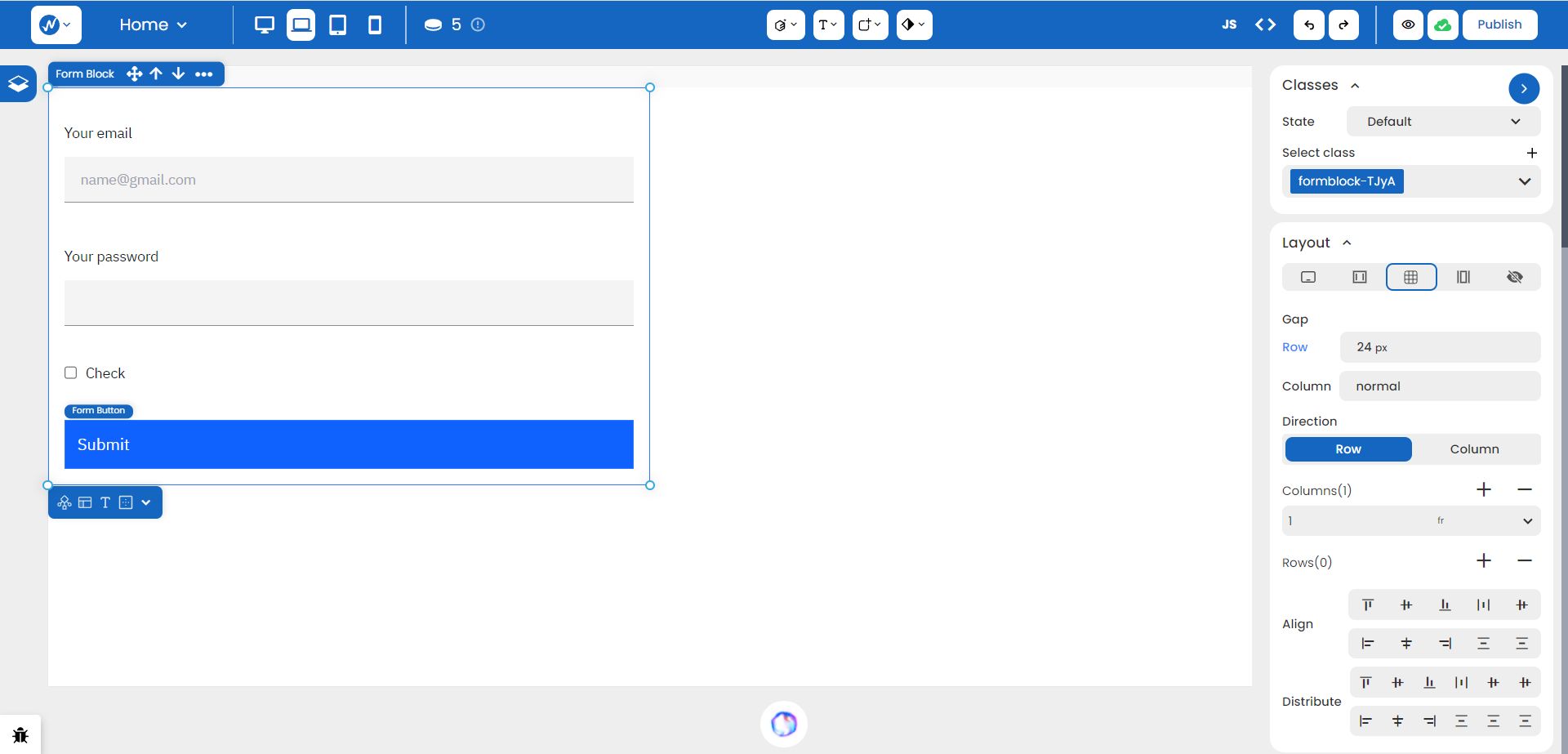
Notice that the layout of the form block in the Styles panel is set to Grid. We will learn more about Grids, Flexbox, and different arrangements in our course later on.
Components
Video
With this feature, you can seamlessly integrate videos and bring your content to life. Like other elements, the Video component can easily be dragged onto the canvas. By default, there is a filler video set in place.
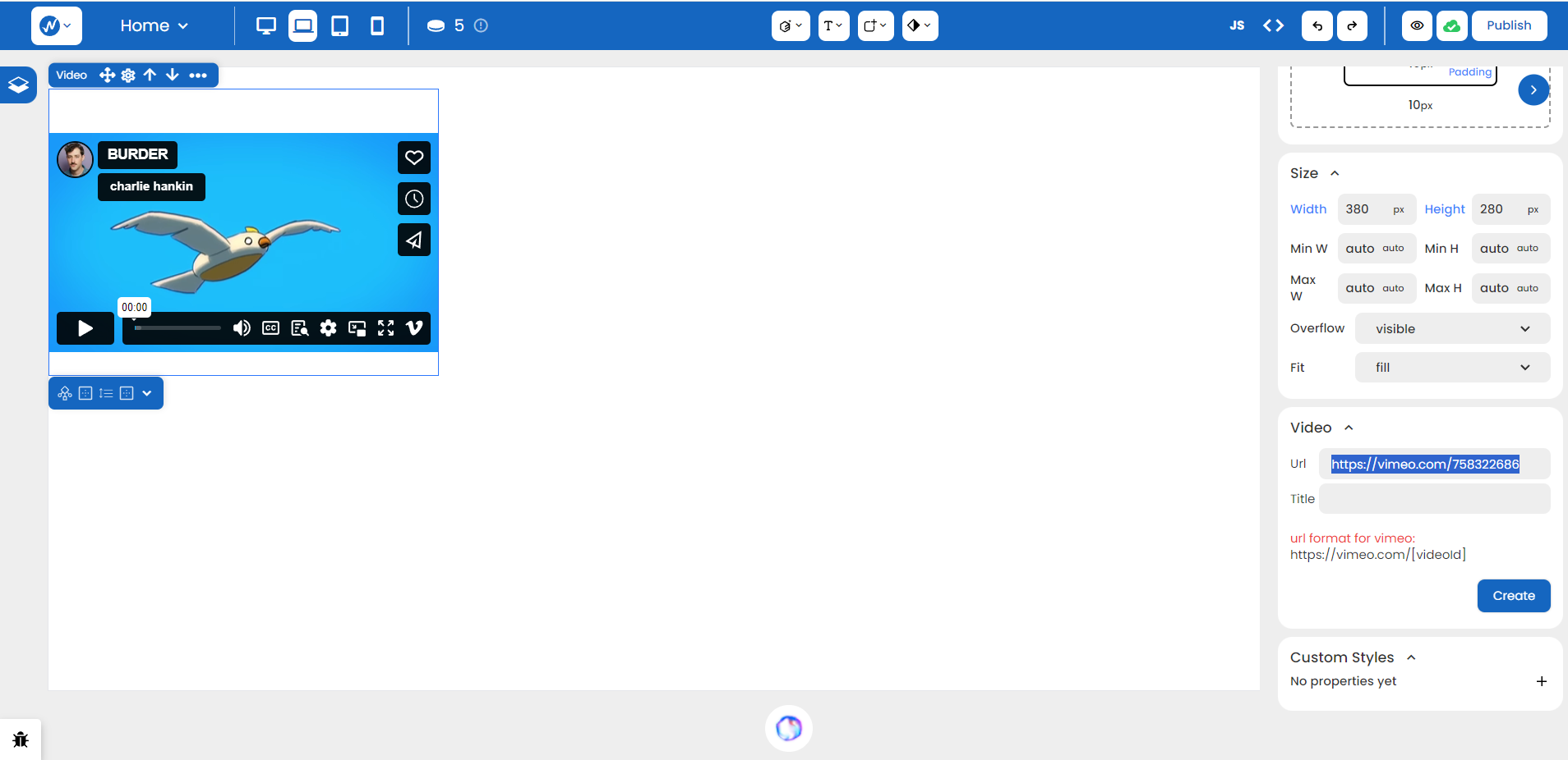
The highlighted URL on the Styles panel can be replaced with a destination URL as required.
Image
Similar to the Video component, the Image feature helps you incorporate images into your website. Whether you’re showcasing products, sharing moments, or enhancing the overall aesthetics of your site, the Image component is your go-to tool.
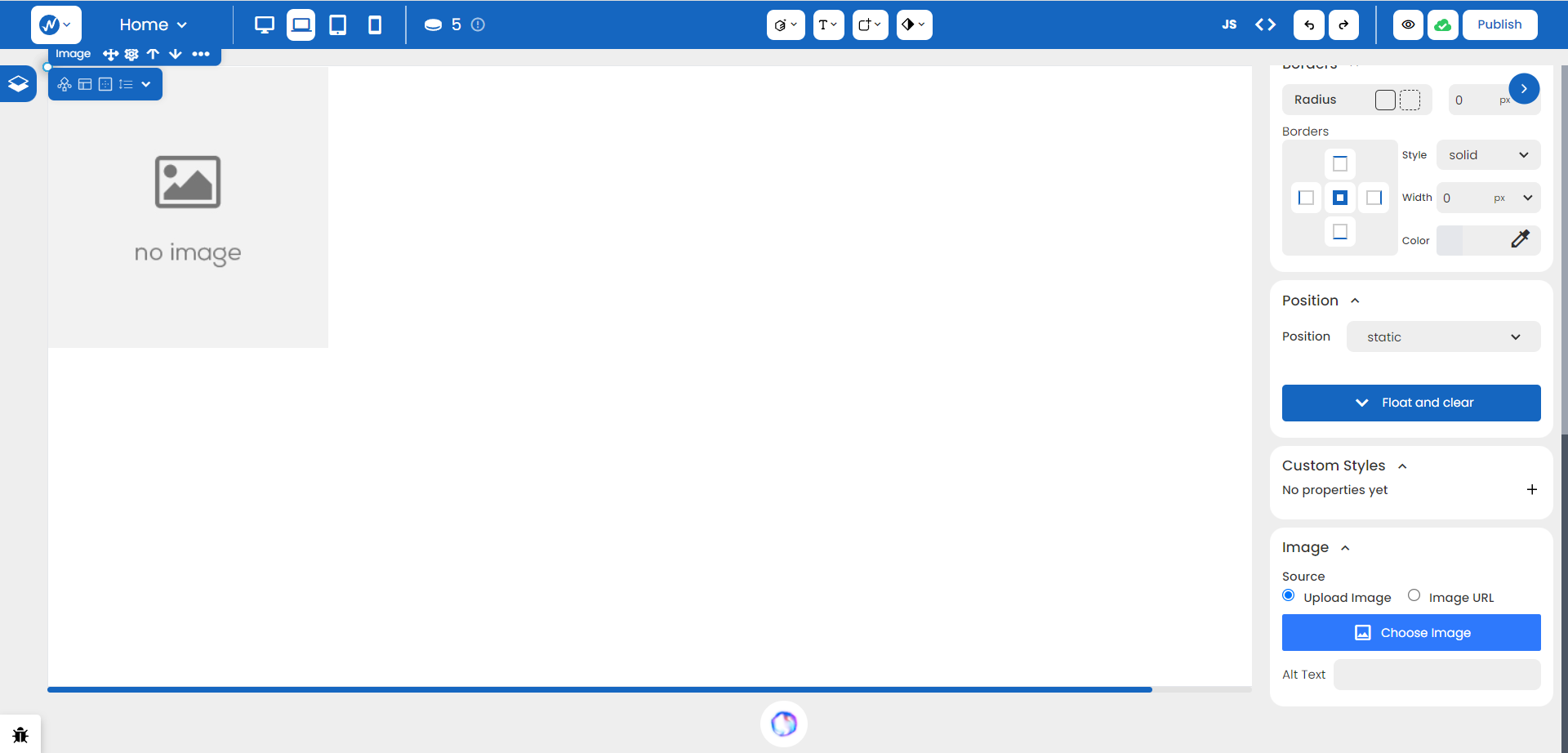
With this, you can either upload an image from your local storage or simply specify a URL in the options provided in the Styles panel.
Image Carousel
The Image Carousel component provides an interactive way to display a series of images in a rotating fashion. In this way, users can navigate through the images, creating a dynamic and engaging visual experience on your website.
Conclusion
The intuitive editor panel makes web design accessible to all, regardless of coding expertise. With the basics of the no-code editor in hand, you are equipped with designs that can elevate your business to the next level.