A Look at the Styles Panel
The Styles panel sits at the heart of WebbsAI. For every component on your webpage, from one simple heading to intricate sections, this panel houses all the tools you need for the proper customization of your site.
To access this panel, click on the paintbrush icon on your right.
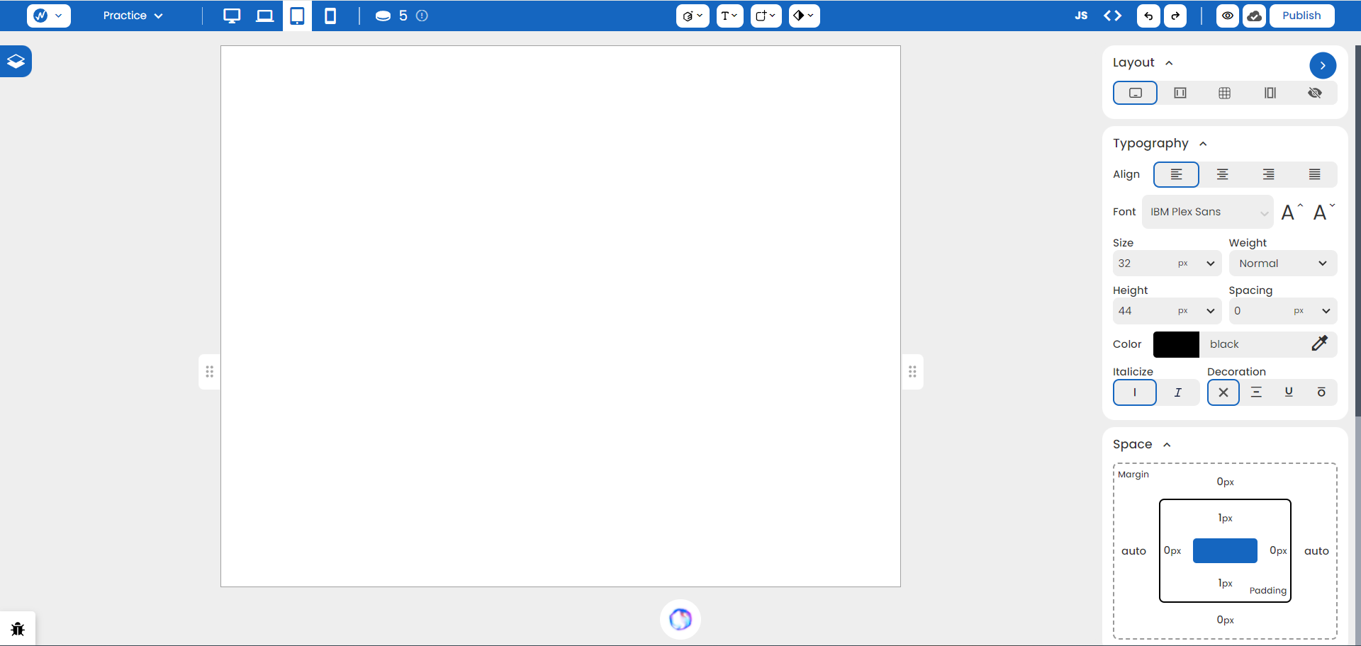
Each section serves some defined functionality.
Classes
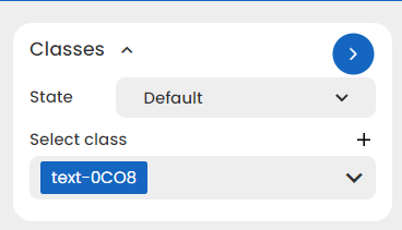
Imagine a blueprint for styles. If there’s more than one text that needs a blue color, 20 px size, and a 28 px height, then you can create a class with those specific styles applied to it.
When you use that class on a text element, it automatically sets those styles. There’s no need to redefine from scratch anymore!
When you first style an element, a class name is automatically applied. You can always rename this in the ‘Select Class’ field by clicking on the ↓ icon and then ‘Rename’.
Layout

With Layout, you can define the structure of your webpage and an element’s relationship with the other element.
There are four Layouts defined:
- Block: Occupies the entire width of its container, regardless of content space.
- Inline Block: Takes only the space it needs within its container.
- Grid: Applied on the container or parent element. It arranges child elements in columns and rows (two dimensions).
- Flex: Applied on the container or parent element. It arranges child elements in columns or rows (one dimension).
Often, a new element dragged onto the page has its Layout set to Block.
Typography
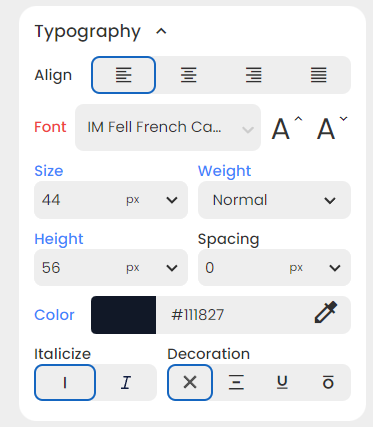
This section styles your text. With easy-to-use and beginner-friendly features like Align, Color, Size, and much more, you can display content that stands out on your page.
When you add a Typography style to any container or parent element, those styles are inherited by its child elements.
Space
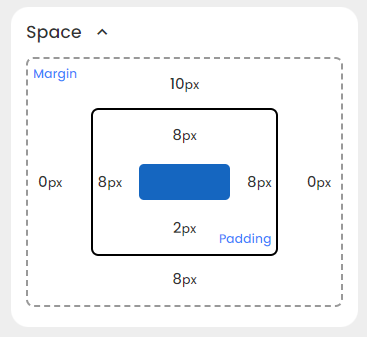
Spacing between your elements and content gives visual breathing room to your website. With WebbsAI, you can add spacing to either all sides of an element or any particular side of your choosing.
The spacing section includes:
-
Margin: Space between an element and its neighbors.
-
Padding: Space between an element’s content and its border.
Size
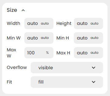
Setting the size of an element decides its width, height and other related dimensions. These values can be absolute (fixed) or relative (vary according to browser size).
Background
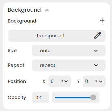
Backgrounds can make your website look more lively. You can set different types of backgrounds, which can include:
- Setting a simple color for a clean look.
- Using vibrant gradients for visual impact.
- Adding an image for deeper engagement.
Options like Size, Position, and Opacity controls can fine-tune your background to fit your site better.
Borders
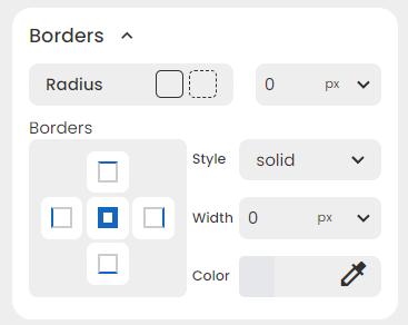
Accentuate your elements with outlines and customize their shapes with border-radius. You can adjust three key border properties:
- Style (dotted, dashed, etc.)
- Width
- Color
Position
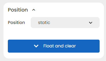
Choose how your element sits within its container. Select from options like:
- Static: Follows the document’s flow.
- Relative: Positioned relative to its original location.
- Absolute: Positioned relative to the nearest positioned parent element.
- Fixed: Stays stationary even when the page scrolls.
- Sticky: Initially behaves like Relative, then switches to Fixed at a specific scroll point.
Effects
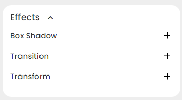
Effects, such as animations, transitions, and hover states add a layer of visual appeal to different elements on a webpage.
You can explore three options:
- Box Shadow: Create depth and dimension.
- Transition: Animate changes between element states.
- Transform: Apply rotation, scale, and other effects.