How to Pick a Color Scheme for your Website
Using the same colors throughout your website makes it easier for people to remember your brand. If you don’t pick your colors ahead of time, your website might fall short of looking consistent and visually appealing. Think of it as laying a foundation for your brand’s visual language that users can easily connect with.
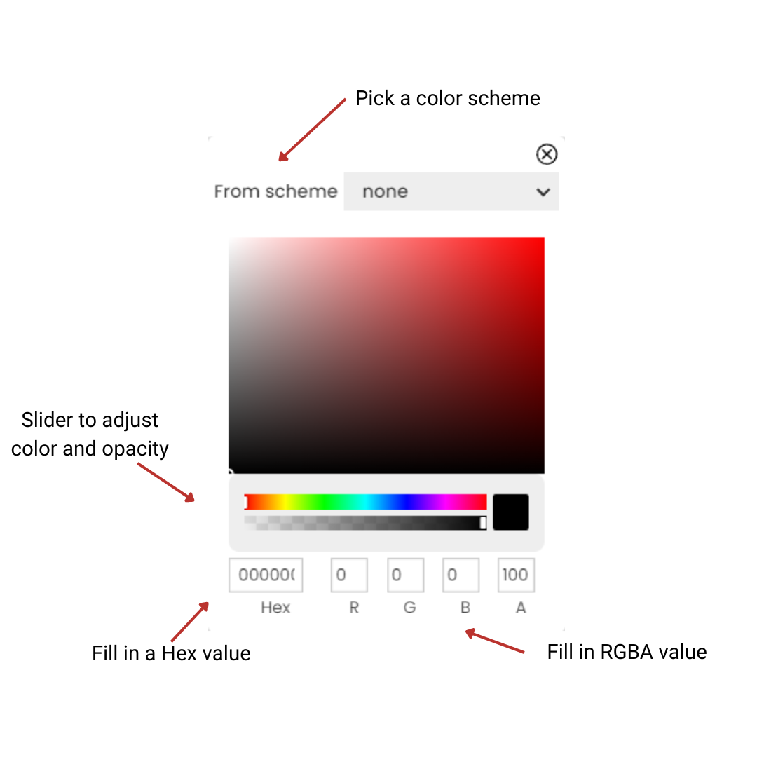
WebbsAI provides five unique ways to adjust your colors:
-
Adjust the vertical sliders in the custom colors option to get the desired color and opacity.
-
Use an eyedropper tool to pick any color you see on your screen.
-
Use hexadecimal notation to get the color of your choice.
-
Use RGBA notation to get the color of your choice.
-
Make use of color schemes defined by you from the beginning.

Making Use of Color Schemes in WebbsAI
Color Schemes is a feature in WebbsAI (Styles > Color Schemes) that consists of four main colors that are used in combination so that we end up with a visually appealing design for our website. Each color has a specific purpose:
Primary Color: It is the dominant color in your design. This color is often used for backgrounds or prominent UI elements and sets the overall tone.
If your primary color is blue, it might be used for the website’s header, main navigation, and prominent buttons. This color creates a strong visual association with your brand.
Secondary Color: To complement the primary color, you can use this color for text, buttons, and other accents.
If your secondary color is a muted green, you can add it as a background, section divider, or any other element that supports the primary blue.
Neutral Color: It provides a background for the more vibrant primary and secondary colors. With a cleaner and more professional look, this color helps enhance readability and the design looks more manageable.
Colors like whites, grays, or beige are normally used as neutral colors.
Danger Color: It is a color that is distinctive and highlights warnings, errors, or important alerts on websites. Because it stands out from the other colors, you can use it to draw attention to a piece of information.
Red is usually associated with this category.
You can set all these values according to your preferences from Styles > Color Schemes.
Good Practices When Setting Colors
- Align your color theme with your brand identity. You can use your logo or any other source of inspiration for consistency.
- Make sure there’s sufficient compatibility between two sets of colors. For example, white text on a black background creates too much contrast which can cause eye strain when users read the text over an extended period. Instead, using a dark gray background can strengthen reading stamina.
- For websites that want to elicit emotional responses from the user, a diverse color palette is a good choice.