Set Spacing on Your Website
Spacing helps balance the page’s design, improve readability and the overall user experience. While the process of adding spacing to websites is generally tricky, we’ve simplified it down to sliders and editable values.
In website development, you’ll generally encounter two types of spacing:
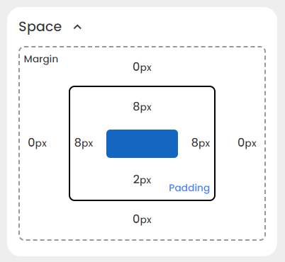
- Padding: The transparent area between your content and its border
- Margin: The transparent area between your content’s border and the neighbouring elements.
You can access them both in Styles > Space section of every element.

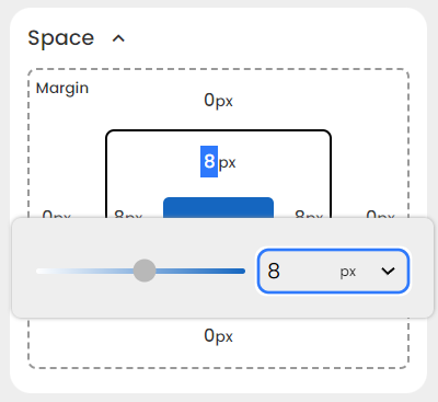
To change a certain value, simply click on it.

You can either type in a value or adjust the slider to your liking.
With the unit dropdown, you can choose to set it to an absolute unit or a relative one. You can also set it to auto.
NOTE: Typing negative values applies spacing in the opposite direction.
Good Practices For Spacing
-
Maintain consistent margin values for elements throughout your website for a cohesive design.
-
Apply larger padding to more important elements, so there’s a visual hierarchy. For example, a larger padding on a section heading compared to regular text.
-
Group related elements by placing them closer together, and use larger spacing to separate distinct sections. In this way, users can understand the relationships between different parts of the content.
-
Use relative units, such as percentages or
em, for spacing to ensure a responsive design. -
Adapt spacing to suit the nature of the content. For example, e-commerce sites may require different spacing than news websites.