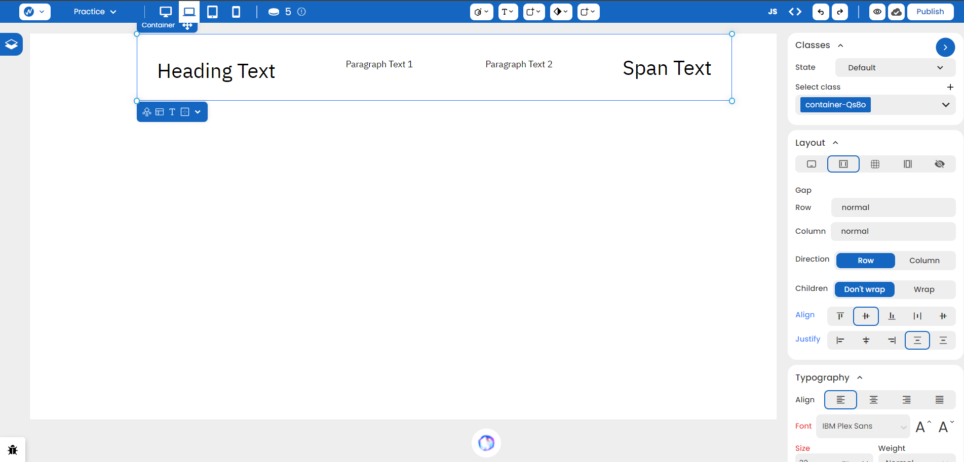
Using Flex
Flexbox, also known as flex or flexible box layout, is a powerful tool for aligning elements within a container. It operates in one dimension so you have efficient layout control either vertically or horizontally.
Flexbox is set as a display property in WebbsAI.
Flex Components
When implementing flexbox, it is typically applied to a parent element, referred to as the flex parent. The immediate children of a flex parent are its flex children. This setup provides control over the alignment of child elements within the parent.
To create a flex parent:
- Select the desired container element on the canvas.
- Navigate to the Style panel > Layout.
- Choose Flex in the Display property.
Let’s assume you have the following setup.
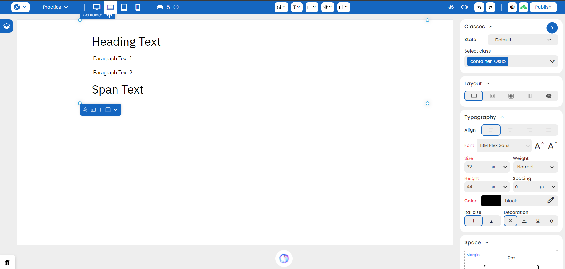
With Flex, you can now change multiple properties:
Direction
As you apply ‘Flex’ to the parent container, the structure changes to this:
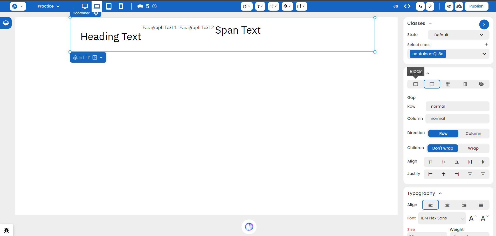
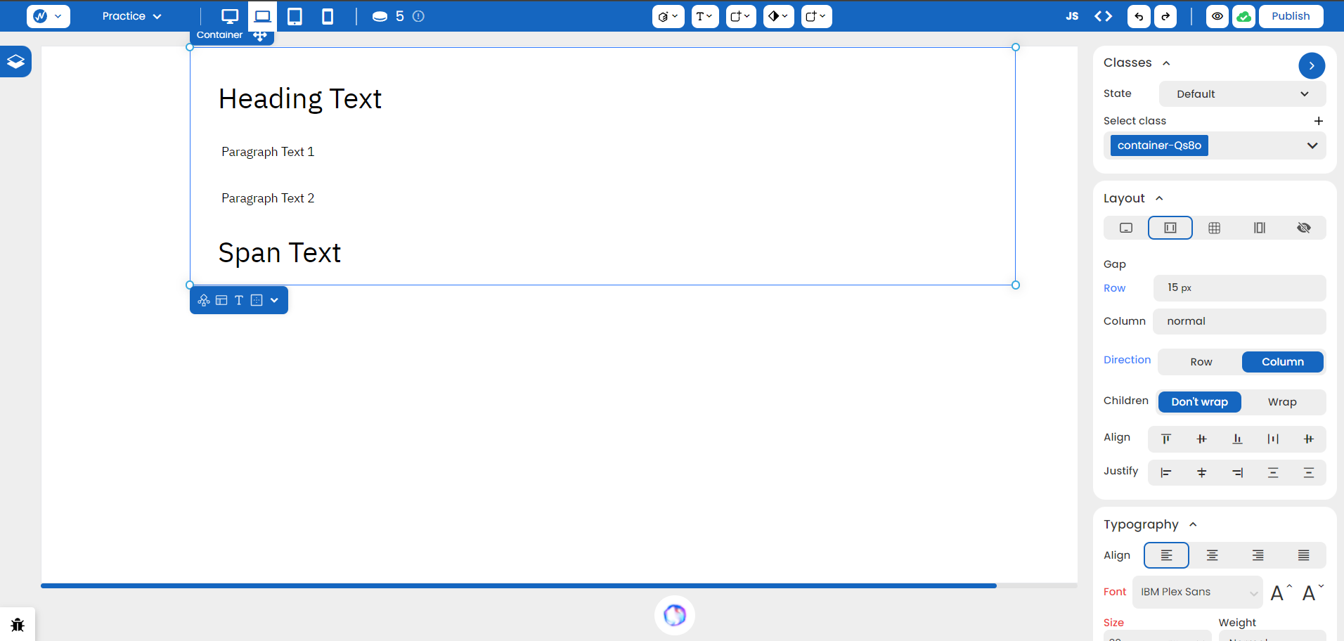
By default, flex parents have a horizontal direction. This can be verified by the selected ‘Row’ value in Direction. We can change it to ‘Column’ to make it look more cleaner here.
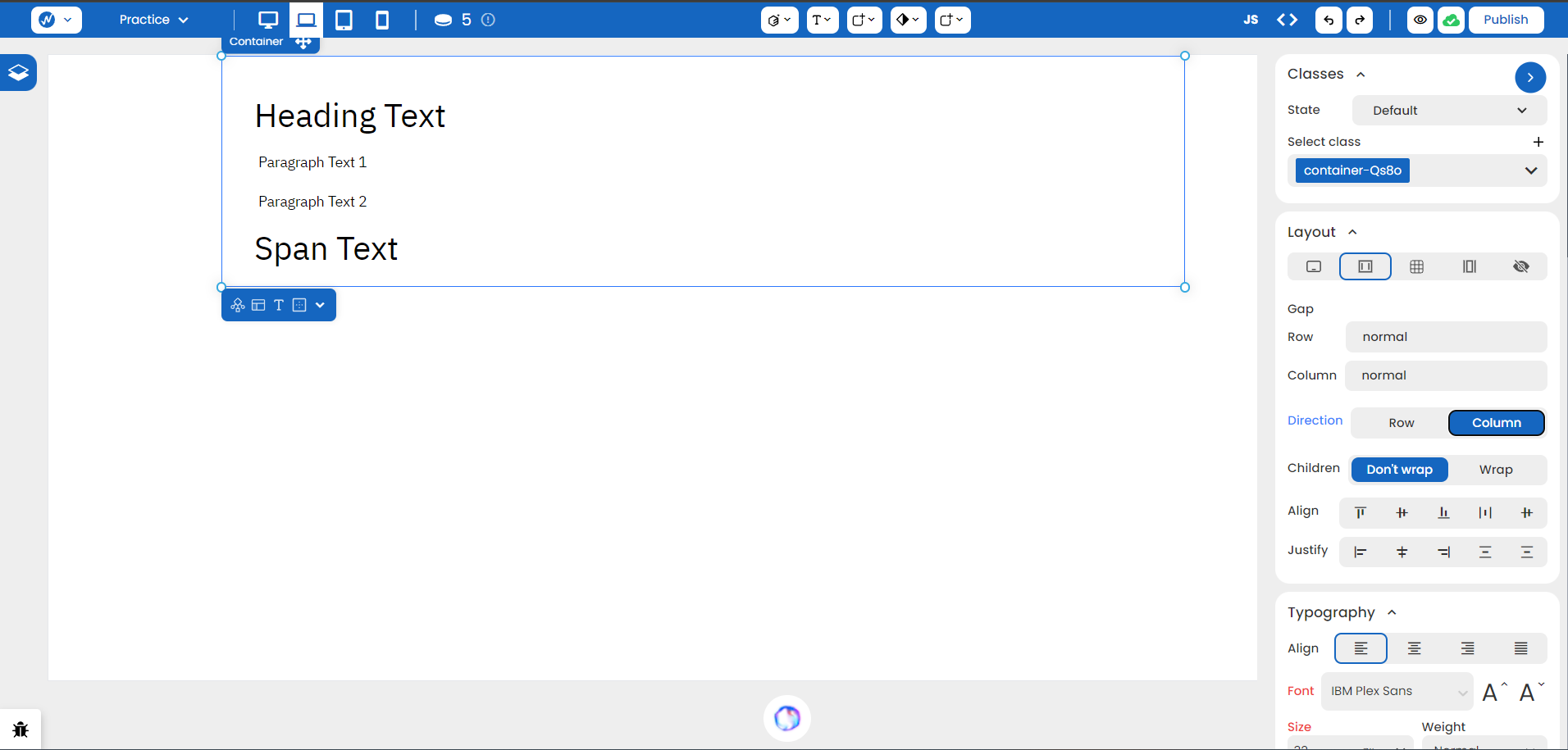
Gap
You can adjust the spacing between rows and columns in the Gap section. Since our flex has a column direction, we can set it to 15 px. There’s no need to work on margin and padding anymore!
Children
Flex children attempt to fit on a single line by default. Enabling wrapping allows multiple rows.
Align
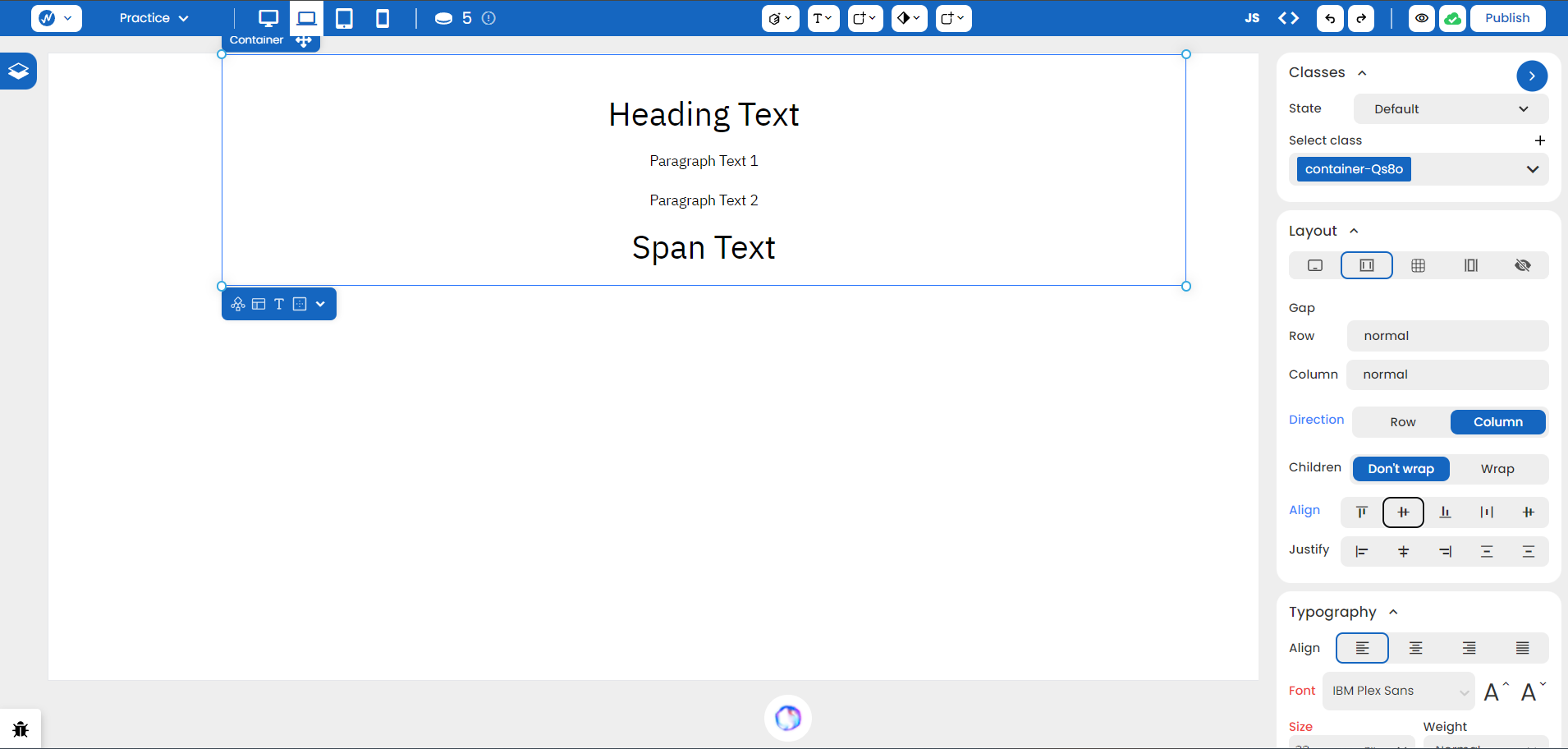
You can also vertically align flex children by controlling the flex parent through Align Left, Align Center, Align Right, Stretch, and Baseline.
This is an example using Align Center:
Justify
Horizontal justification of flex children is determined by the flex parent. This includes Left, Center, Right, Space Between, and Space Around.
The following arrangement is just one way of how this works:
