Using Grid
Grid is a powerful display property that provides the ability to structure content in a grid format. This facilitates easy repositioning and resizing for dynamic designs.
Grid Components
A Grid is typically applied to a parent element. All elements inside the parent element are its immediate children.
To create a grid parent:
- Select the desired container element on the canvas.
- Navigate to the Style panel > Layout.
- Choose Grid in the Display property.
Direction
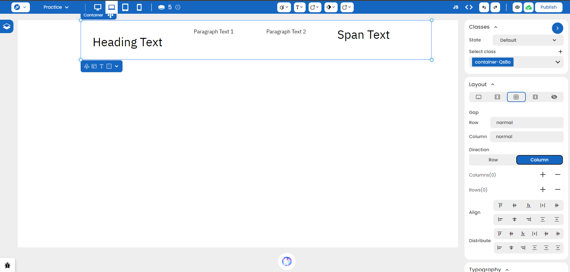
As you apply ‘Grid’ to the parent container, the structure has a ‘Row’ direction by default. As you add elements in cells inside the grid, it might look like there’s no difference but structurally, your website is more responsive to change.
If you change the direction to columns, you can see the difference more clearly.

Gap
You can adjust the spacing between rows and columns in the Gap section. There’s no need to work on margin and padding anymore!
Adding and Deleting Rows/Columns
You can right-click on a row or column header to duplicate or delete. Alternatively, Style panel options allow you to add and remove either rows or columns with the respective ’+’ and ’-’ signs.
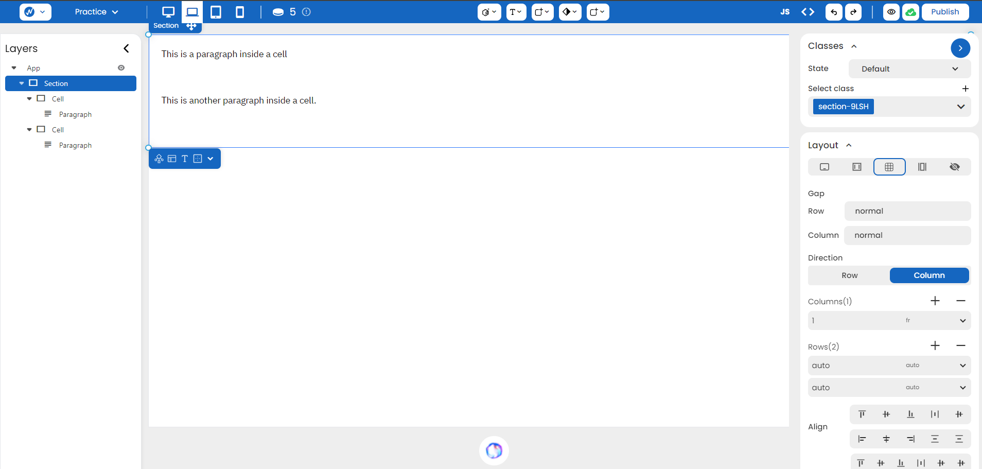
This is one example structure that has two cells in separate rows:

Align and Distribute
You can vertically align your grid children by controlling the grid parent through Align Left, Align Center, Align Right, Stretch, and Baseline.
You can do this horizontally by adjusting options in your Distribute.